Bari
UI/UXVisual IdentityBari is a recovery companion for bariatric surgery. One app that adapts to every stage, and stays with you on the hardest days.
- role
- Visual identity and UI/UX
- timeline
- September 2025 to June 2026 · Final degree project, ESDi
- deliverables
- Research, naming, visual identity, a companion, a design system, a fully interactive prototype
- tools
- Figma, Illustrator
what came out of it
A complete brand, design system, and interactive prototype across all five stages of recovery. Built and tested from real patient research.
The short version.
Every year, more than 600,000 people have weight-loss surgery, also known as bariatric surgery. The operation takes a few hours. The recovery takes years, and it moves through five distinct stages, almost all of it at home.
Each stage brings its own rules: what to eat, how much, which supplements to take, what counts as an emergency. All of it changes as the body heals, and all of it lands on one person to track, remember, and get right.
“I almost cried because I didn't know what to take, when to take it, or if I had already taken it.”
This is what fifty-one patients described. A third of them tracked nothing at all. Not one was using a tool built for their recovery. The feelings they named most were anxiety and overwhelm, from carrying the whole thing alone.
the idea.
Bari brings the whole recovery after bariatric surgery into one place and shapes it around you, showing only what you're ready for, when you're ready for it. It turns years of guessing and worrying alone into something guided, personal, and finally calm.
The world.
A recovery brand has to be trusted with your health without ever feeling like a clinic. So I built Bari warm from the start: the name patients already use, a logo taken from the surgery, a companion where other apps put a chart.
the brand.
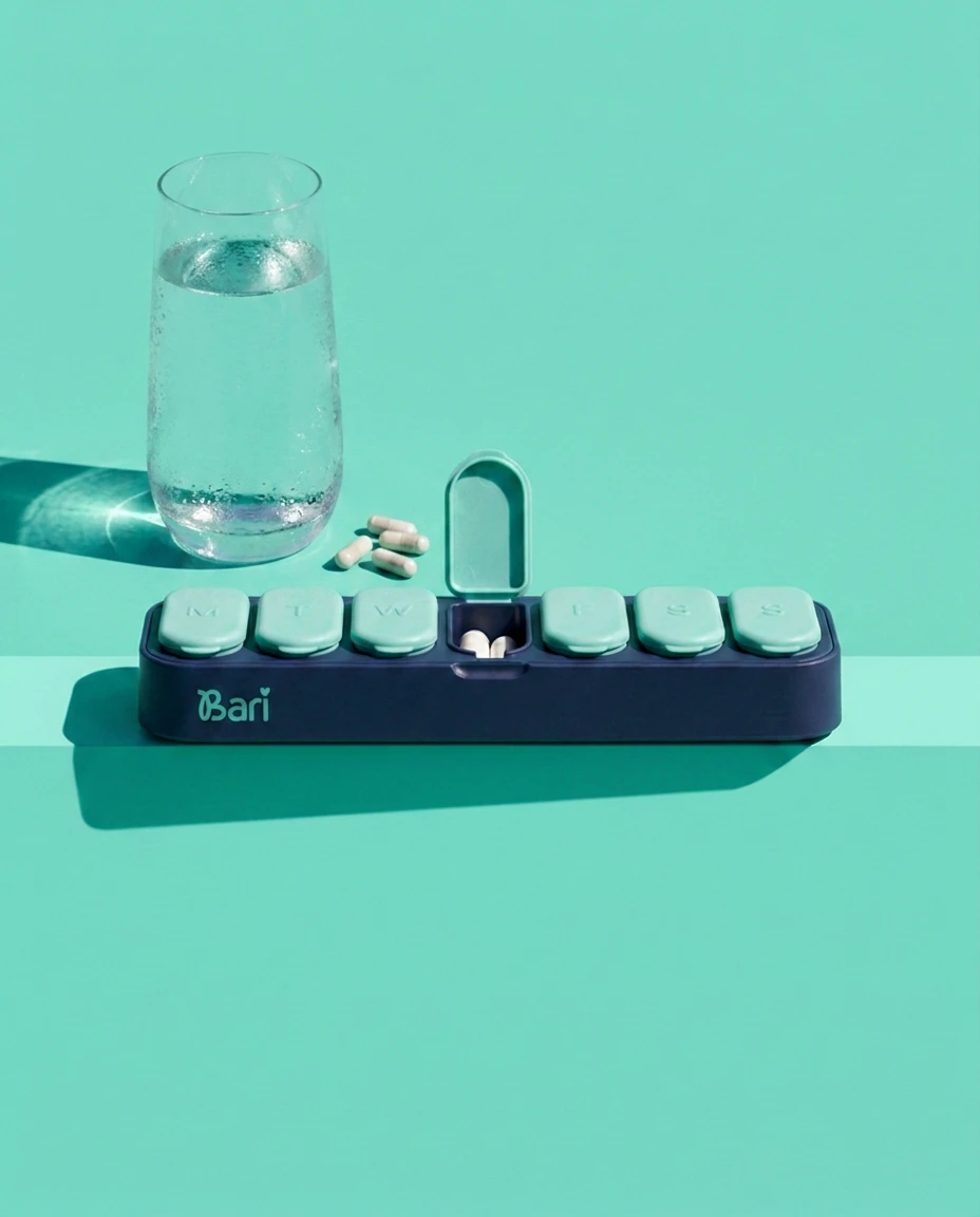
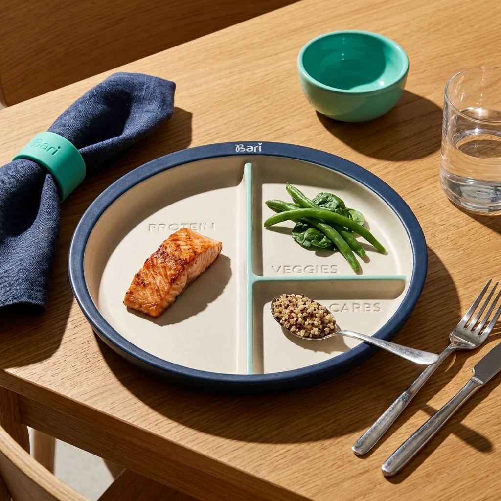
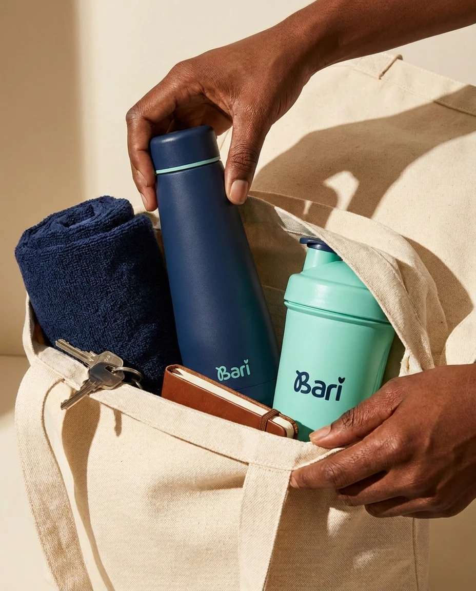
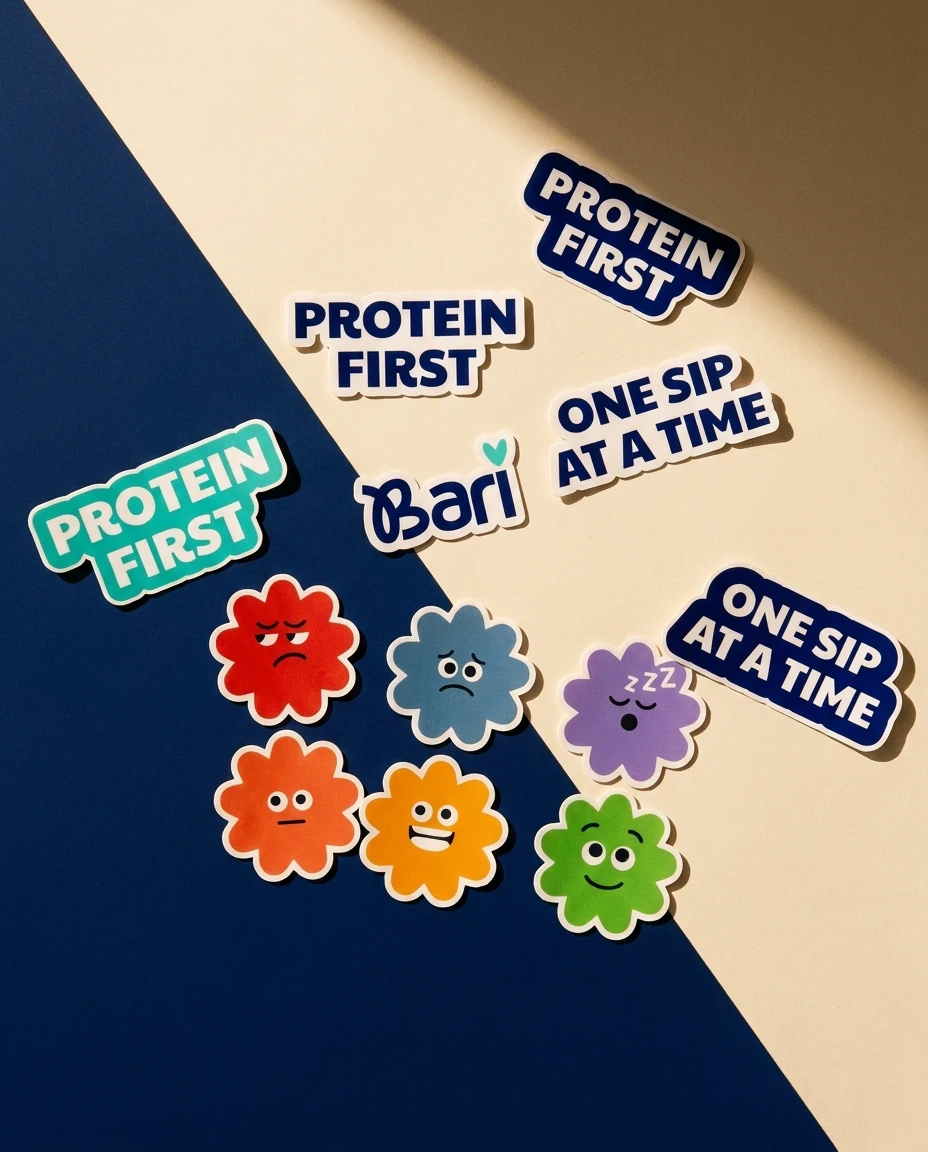
Patients already call themselves baris, so the name was there before I started. The logo comes from the surgery: the B is the new stomach, and the dot on the i is a heart. The colours are teal and navy, chosen against the two easy clichés, the clinical blue of a hospital and the soft pastels of a diet app, which sell the exact shame Bari is built to undo.
the companion.
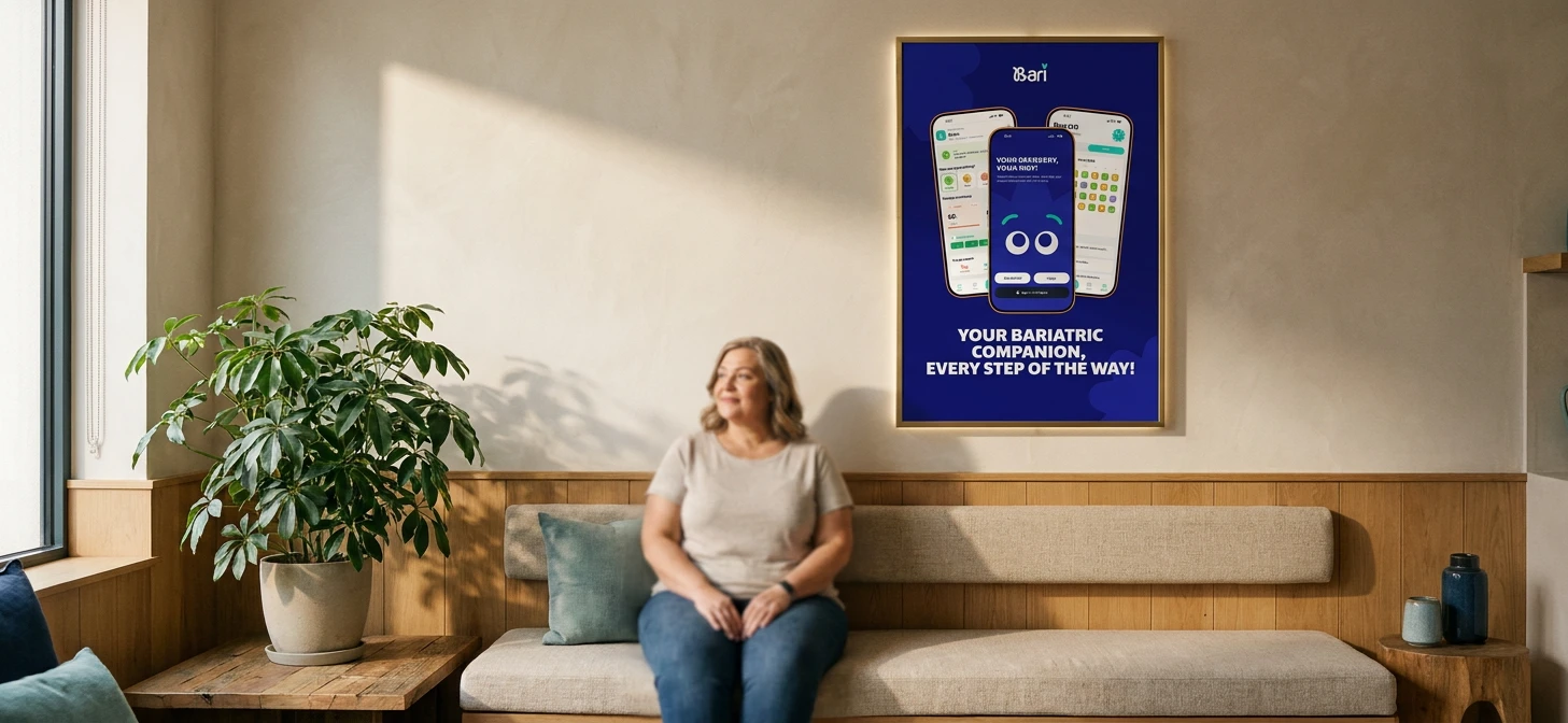
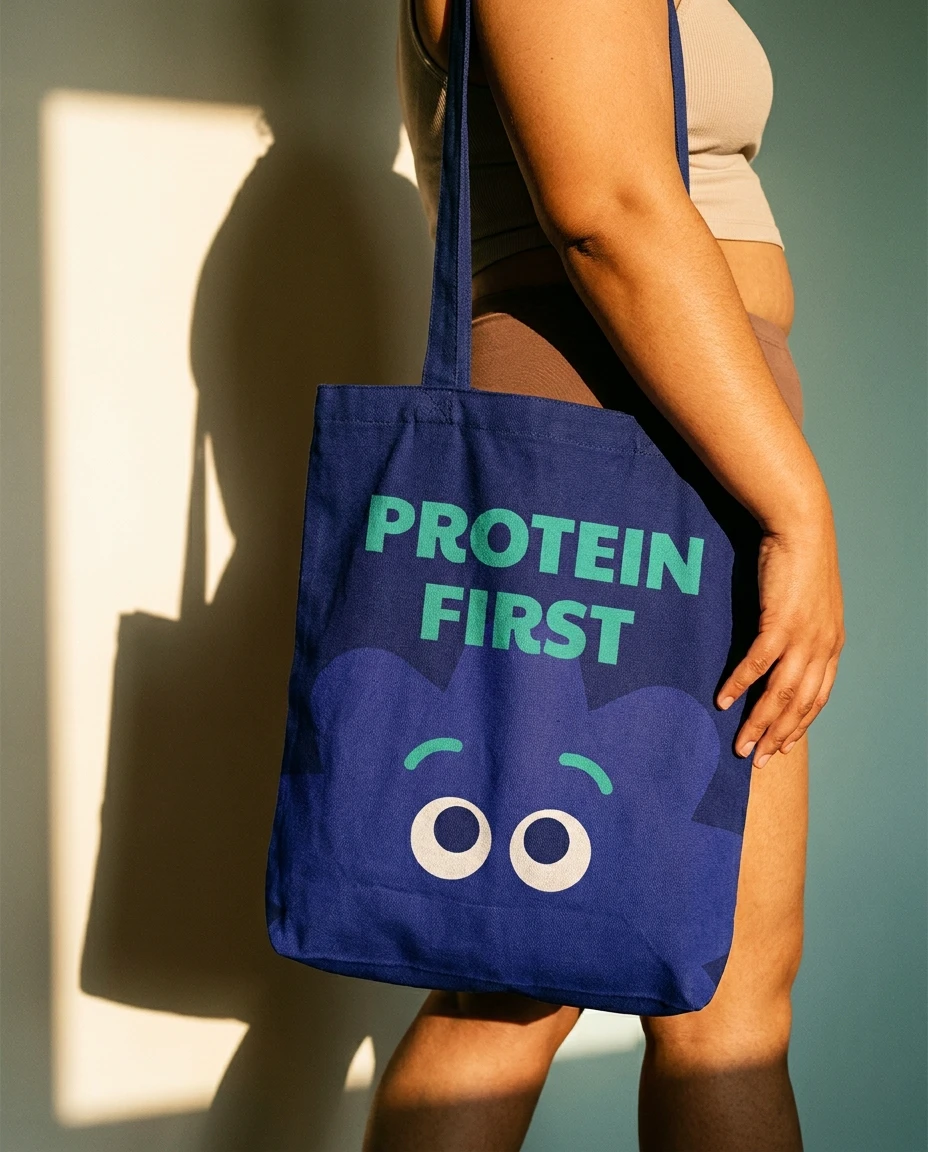
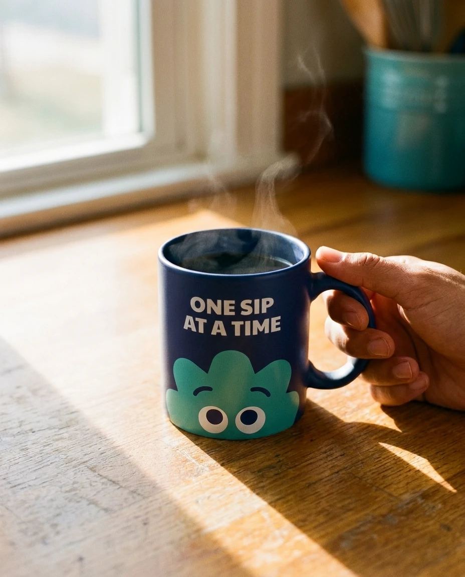
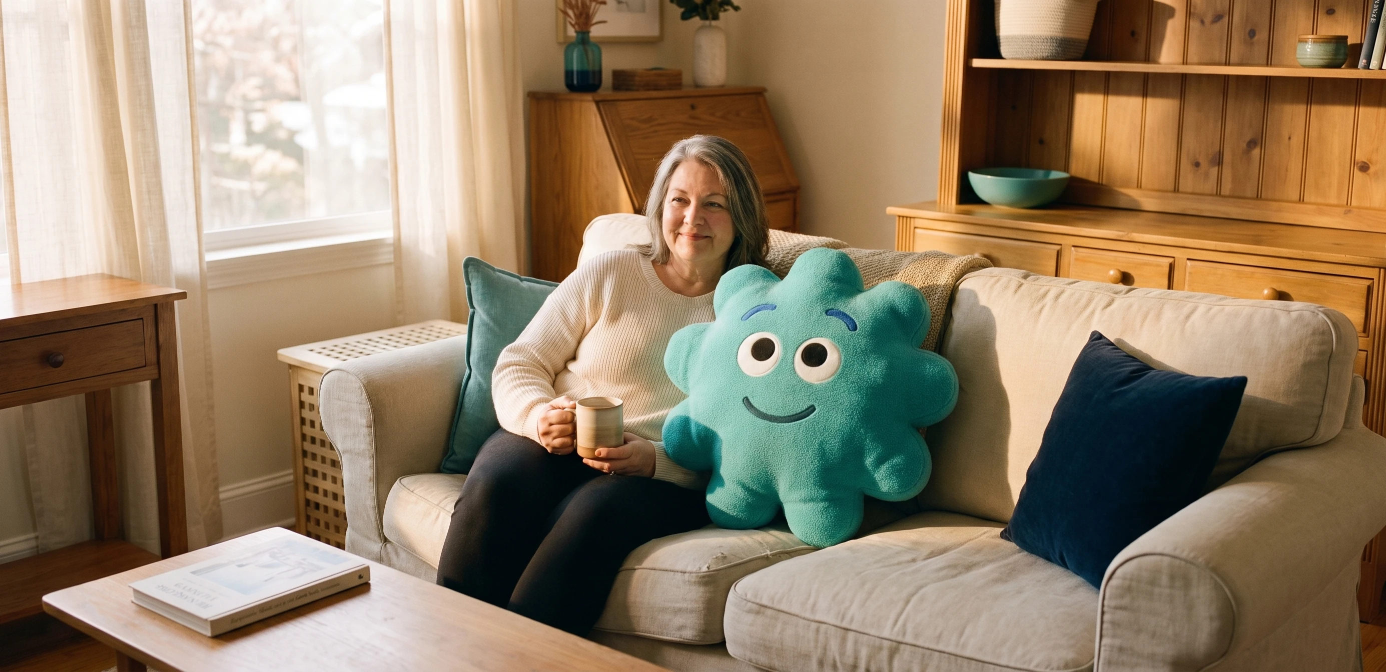
Most recovery apps run on streaks, reminders, and guilt. Bari uses a companion instead. It is deliberately not a body, because the last thing someone healing needs is another body to measure against. Six moods, shown as six faces and six colours, and that is all it needs.
Recovery is care, not correction.
Patients aren’t failing. The system around them is scattered.
The product.
Everything recovery needs already exists. It's just scattered, and every loose piece becomes one more thing the patient has to hold. This is where I pulled it together: one system, a few firm decisions, all of it shaped around the person using it.
the system.
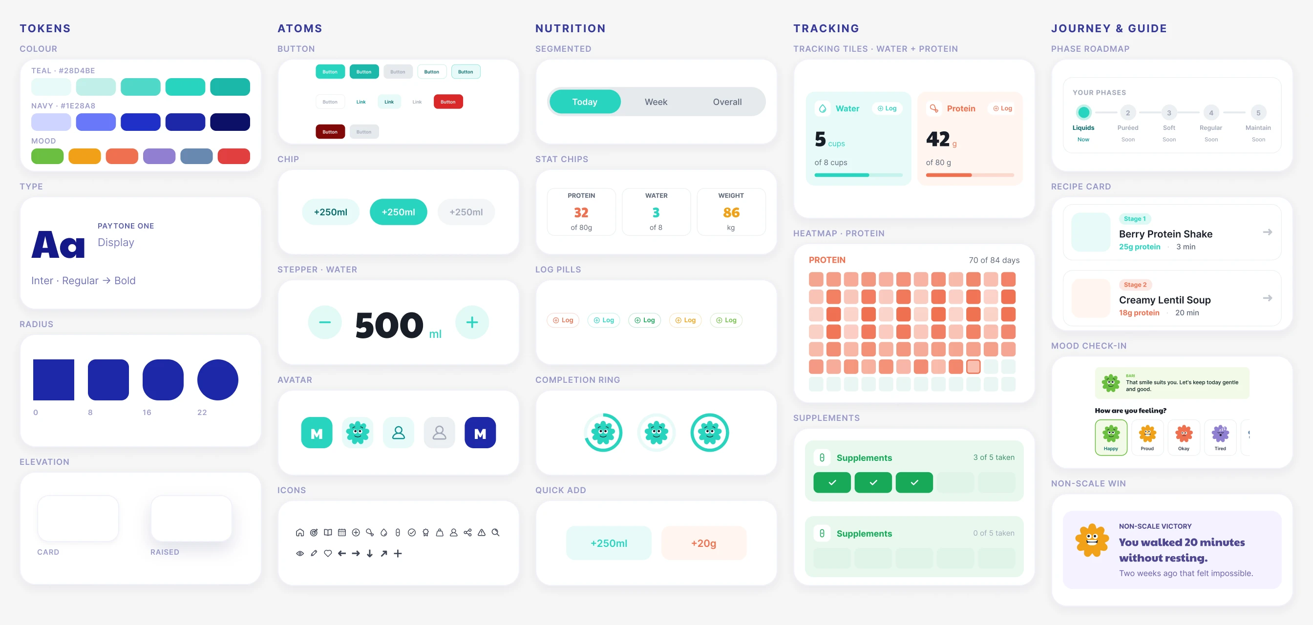
Everything in the app runs on one system: colour, type, spacing, components, and the six moods, defined once and reused everywhere. It kept the whole app consistent under one designer, and it makes Bari ready to build for real and extend to Android.
the app.
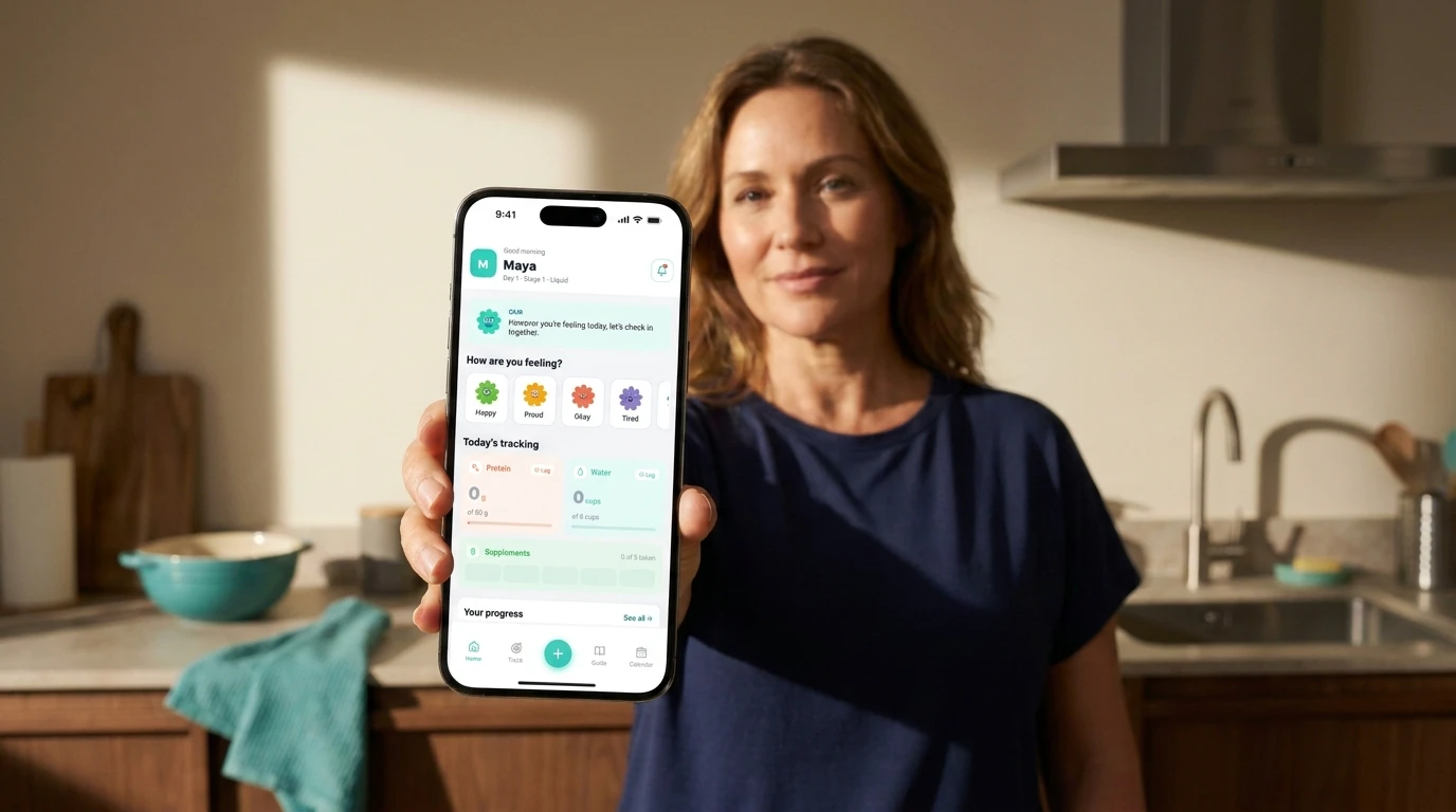
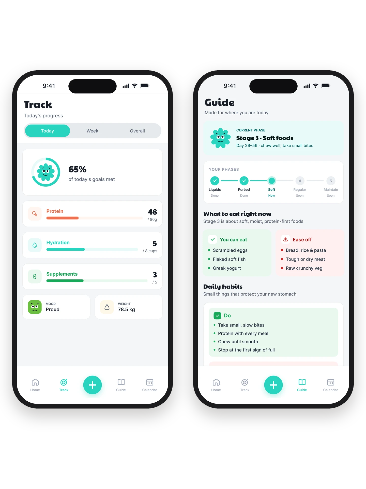
Protein, water, supplements, weight, and mood. Before Bari, people tracked these across a notebook, a few apps, and memory. Bari puts them in one daily loop, where the plan and the tracker are the same screen, so logging is part of following the day, not a form to fill at the end of it.
the onboarding.
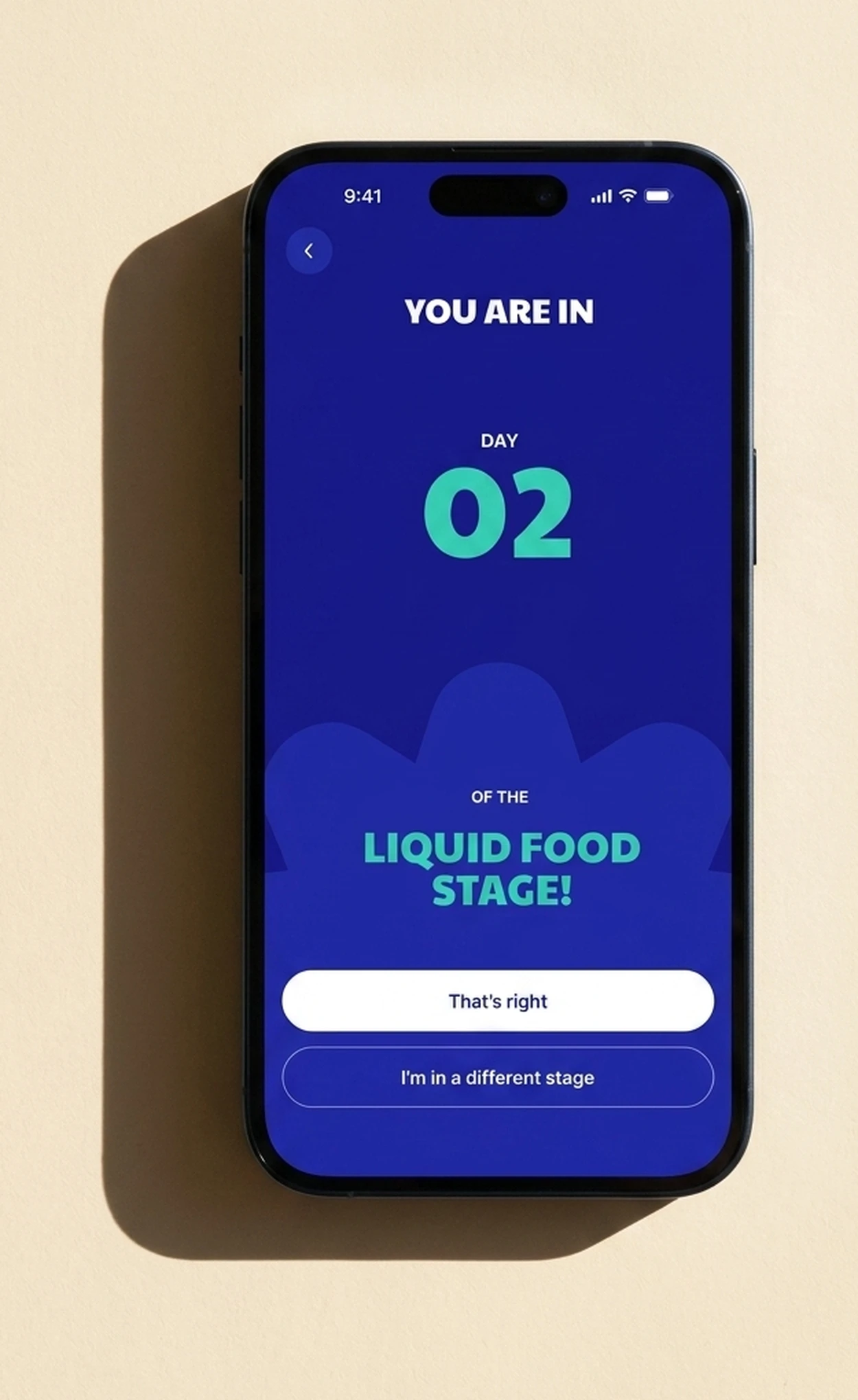
Setup is the longest flow in the app, on purpose. It asks for your surgery and its date, works out your stage, and sets your goals from there. Those few minutes are why every screen afterward already knows where you are.
the guide.
The guide only ever shows what is safe at your stage. In the liquid stage it will not show a solid-food recipe, because that is not clutter, it is a danger. As you move through the five stages, the guidance, the goals, and the companion all change with you. The app you open in your second year is not the one you opened the day after surgery.
“I don’t think the surgery failed. I think the support system did.”
The details.
The hardest day is the one most apps ignore. But in recovery, the low days are exactly when someone decides whether to keep going. So those are the days I designed for.
every victory counts.
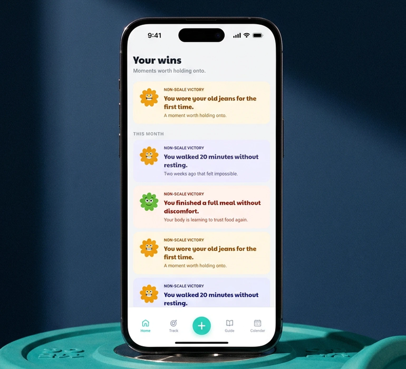
Bari tracks the wins that never show up on a scale, the ones you log yourself: climbing the stairs without stopping, a thirty-minute walk you couldn't manage last month. When progress has always been a number on a scale, these are the wins that actually feel like recovery.
the bad day.
Log a low mood, and Bari does not try to fix it. The companion answers with one sentence, and asks for nothing back. Most apps offer encouragement at the worst possible moment. On a hard day, the kindest thing an app can do is want nothing from you.
the long view.
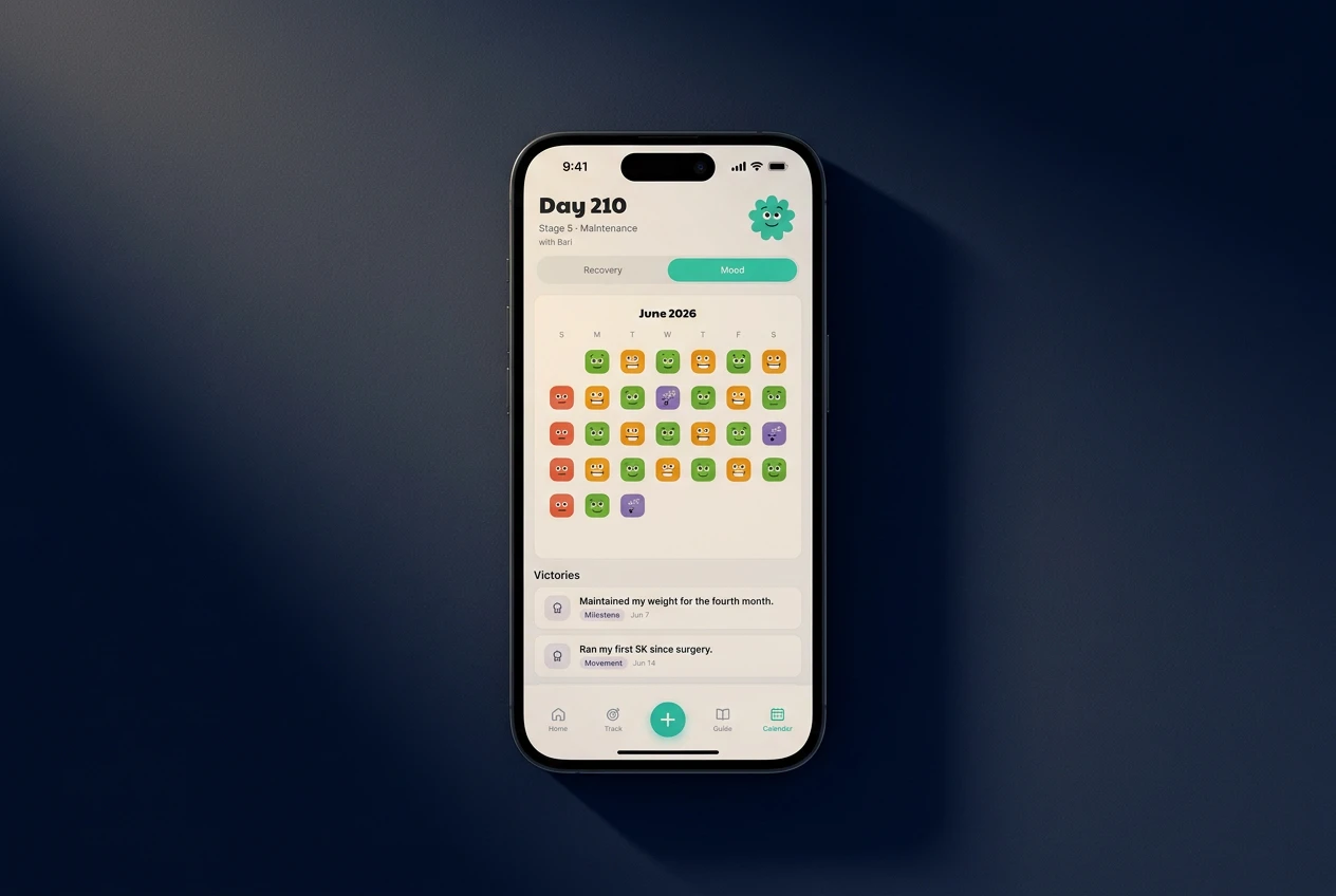
A single bad day can feel like the whole screen. The calendar shows the full month, so that day becomes one square among thirty, and a hard week stops looking like the whole recovery.
In a health context, tone is part of care.
What changed.
Bari closed as a complete prototype, from the brand to a build-ready design system. Here's what I got wrong on the way there, and the parts I chose to cut.
the one that broke.
The first companion grew a body as you made progress. I liked it, until I saw the problem: a body that grows as you succeed is a body you compare yourself to, the exact thing Bari is meant to prevent. So I cut it. The final shape never changes.
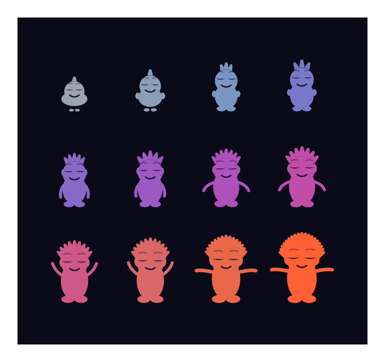
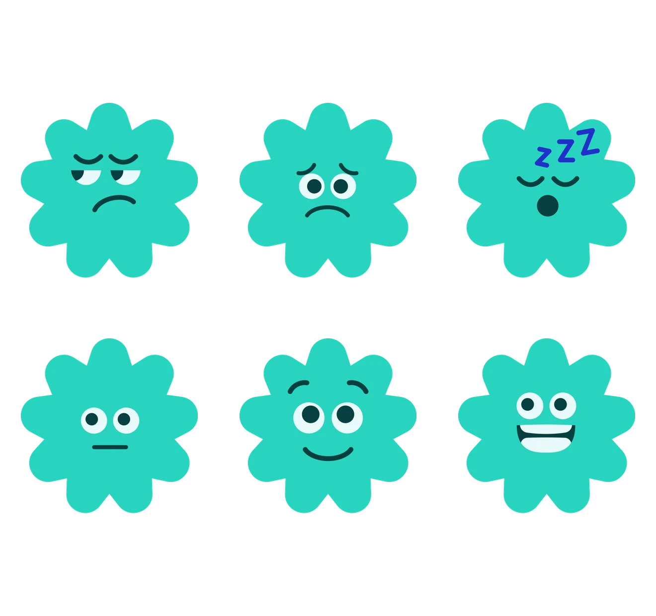
I gave the companion a body that grew with yours. That was the mistake.
the cut.
The first version tried to do everything: a community feed, recipes, meal plans, appointment tracking, calorie counting. It was too heavy for someone with no energy to open it. The research was clear that people were already overwhelmed, so I cut it down to two things done well: tracking, and stage-aware guidance. The rest is on the roadmap.
“I felt like I was managing a project instead of recovering.”
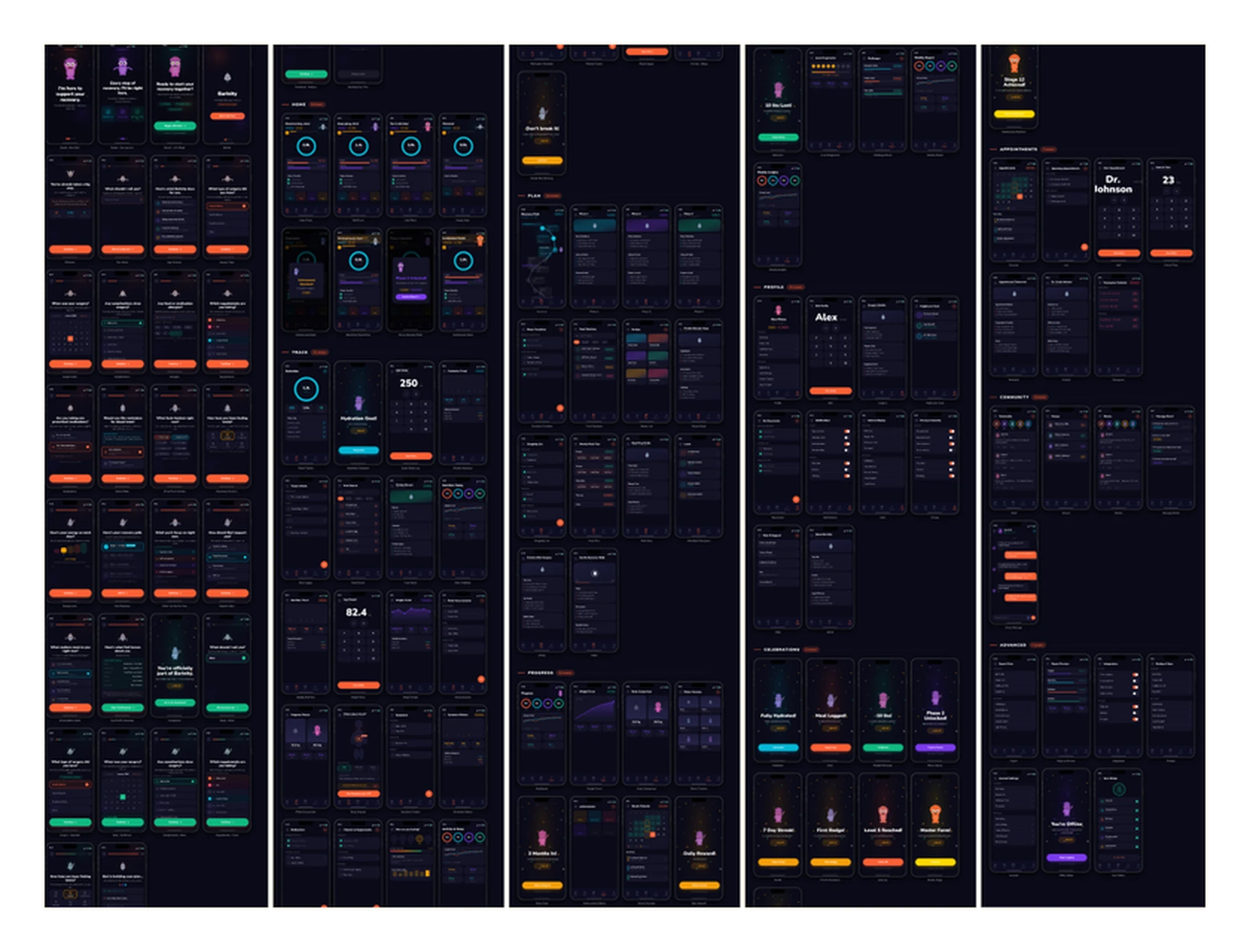
if I kept going.
The cut features are not gone, they are planned for later, added back as someone reaches the calmer stages and has room for them. Bari is a design proposition, not a medical product. The honest next step is a pilot with a real clinic, and guidance written with dietitians.