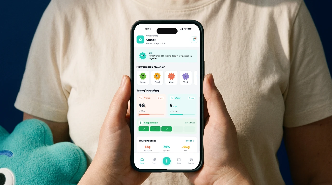
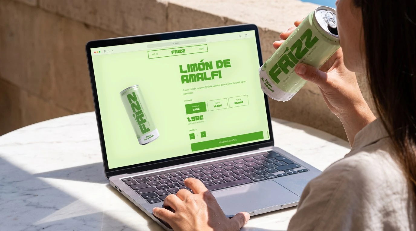
Vianda
UI/UXVisual IdentityVianda is a food app where anyone can cook for their neighbours and get paid for it. Not another delivery app. The opposite of one.
- role
- Visual identity and UI/UX, in a team of four
- timeline
- Feb to July 2026 · Master’s thesis, Elisava
- deliverables
- Naming, visual identity, illustration system, design system, 163 screens across two apps
- tools
- Figma, FigJam, Illustrator
what came out of it
163 screens across two apps, one brand, and every illustration in between. Nominated for the Elisava Master Awards, 2026.
The short version.
457,000 people in Barcelona were born somewhere else, and most of them can cook something this city has never tasted. 280,000 students live here too, a long way from home, ordering the same expensive, repetitive delivery from ghost kitchens they’ll never see. Two groups, three streets apart, who have never met.
Barcelona’s best food isn’t in its restaurants. It’s in its kitchens, and it was never for sale. A 2022 decree changed that, and nobody built anything. Vianda is that thing. Not a delivery app with home cooks in it. A market for the cooking a neighbourhood already does, made legal, made visible, made safe. For a hobby, or for a living. Senegalese, Syrian, Catalan, three streets away. A brand for la cocina del barrio.
the idea.
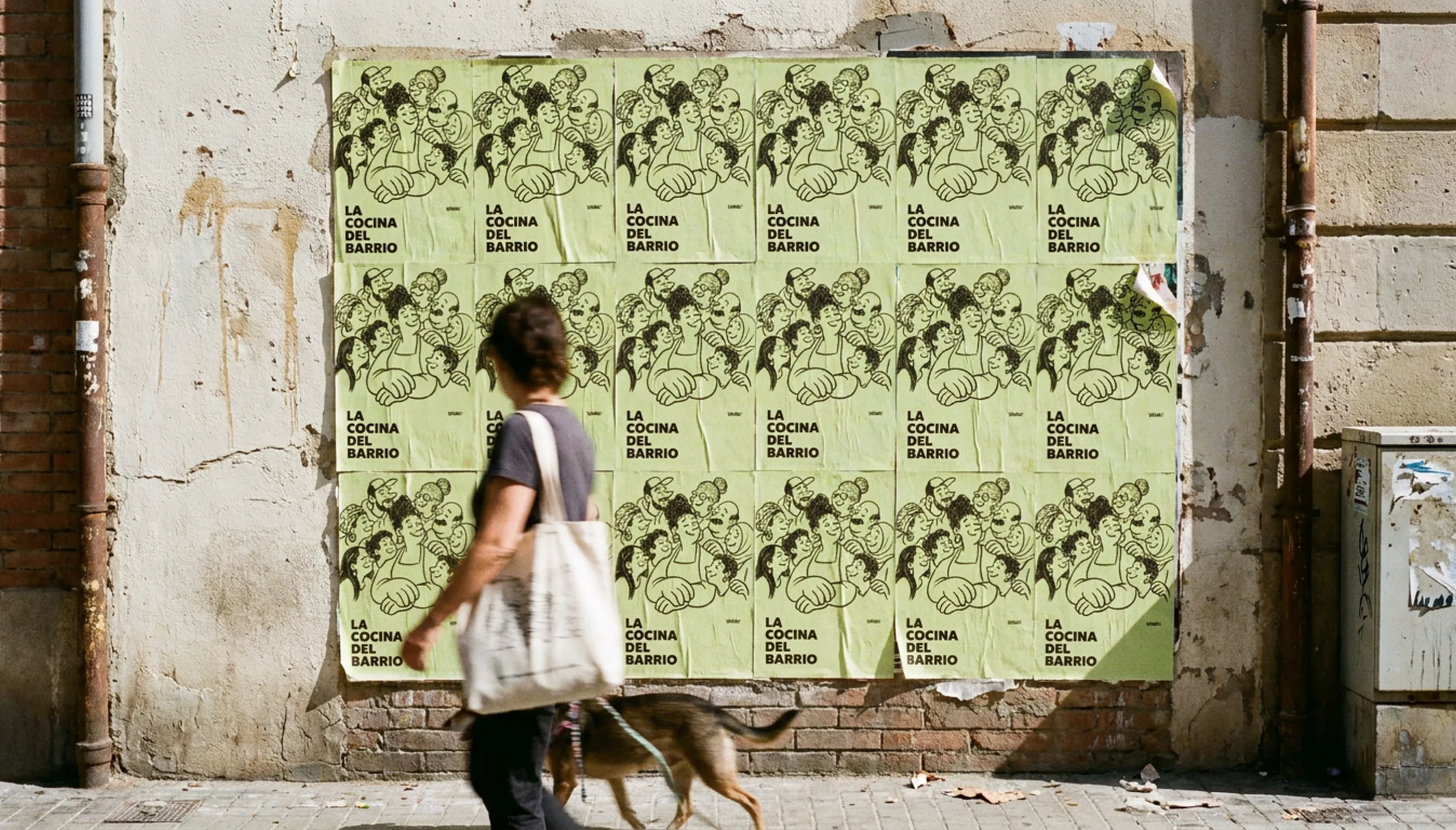
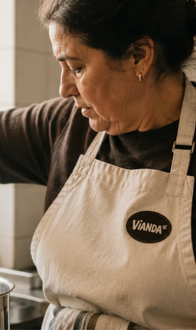
La cocina del barrio sits at the heart of Vianda. Made by and for the barrio, it turns a plate of food into the smallest possible way to share a culture.
LA COCINA
DEL BARRIO
The world.
A brand for home cooking can’t look like a tech startup, or nobody believes the food is real. So I built the whole identity by hand, one name, one set of drawings, one system holding them straight.
the brand.
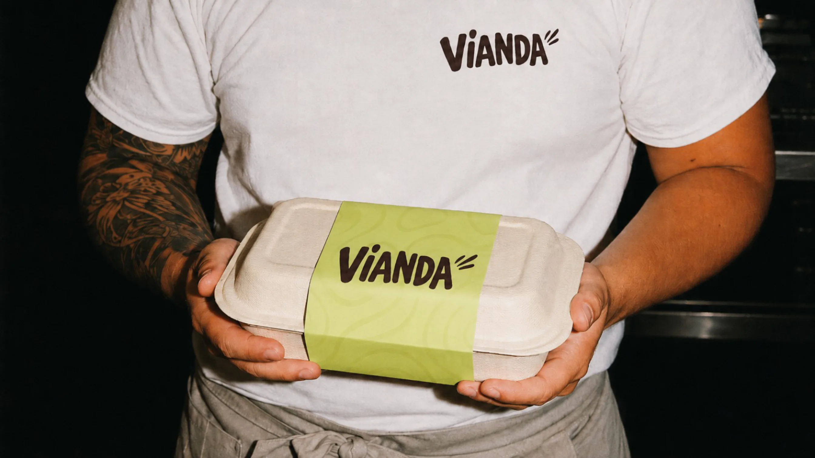
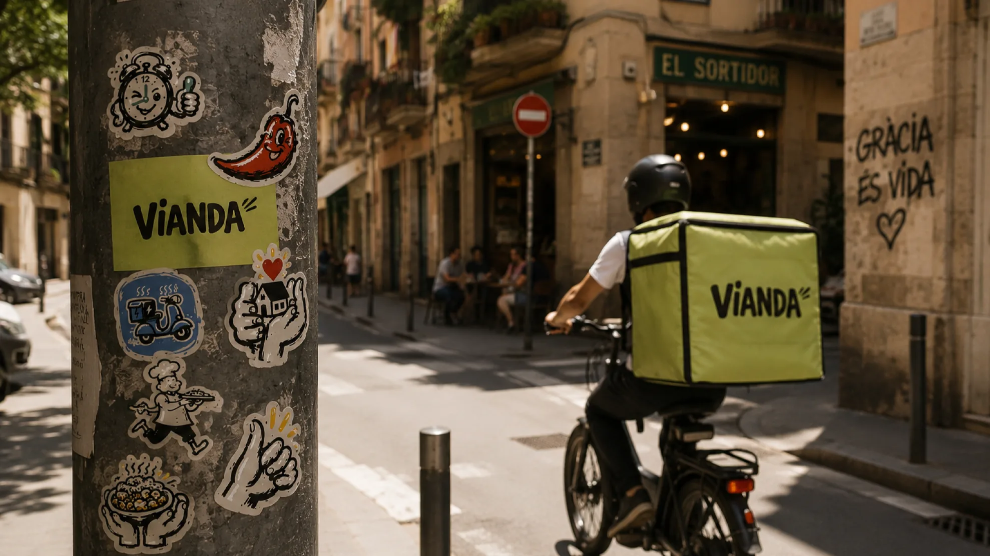
A vianda is the meal you cook at home and carry with you. The word already meant this, it was never a brand name until it had to be. Hand-lettered, never typeset, it shouts in caps the way a market does, works at app-icon size and on a delivery bag, and three dashes trail behind it because it’s always in a hurry.
the illustrations.
One hand draws everything, down to the error screens most apps leave blank. Thirteen allergens, nine diets, fifteen cuisines, thirteen barrios, the whole cast. I drew every one myself, because a stranger’s kitchen only feels safe when the whole thing feels like a person made it, not a platform. Nothing in Vianda is stock, because nothing in a neighbourhood is.
the system.
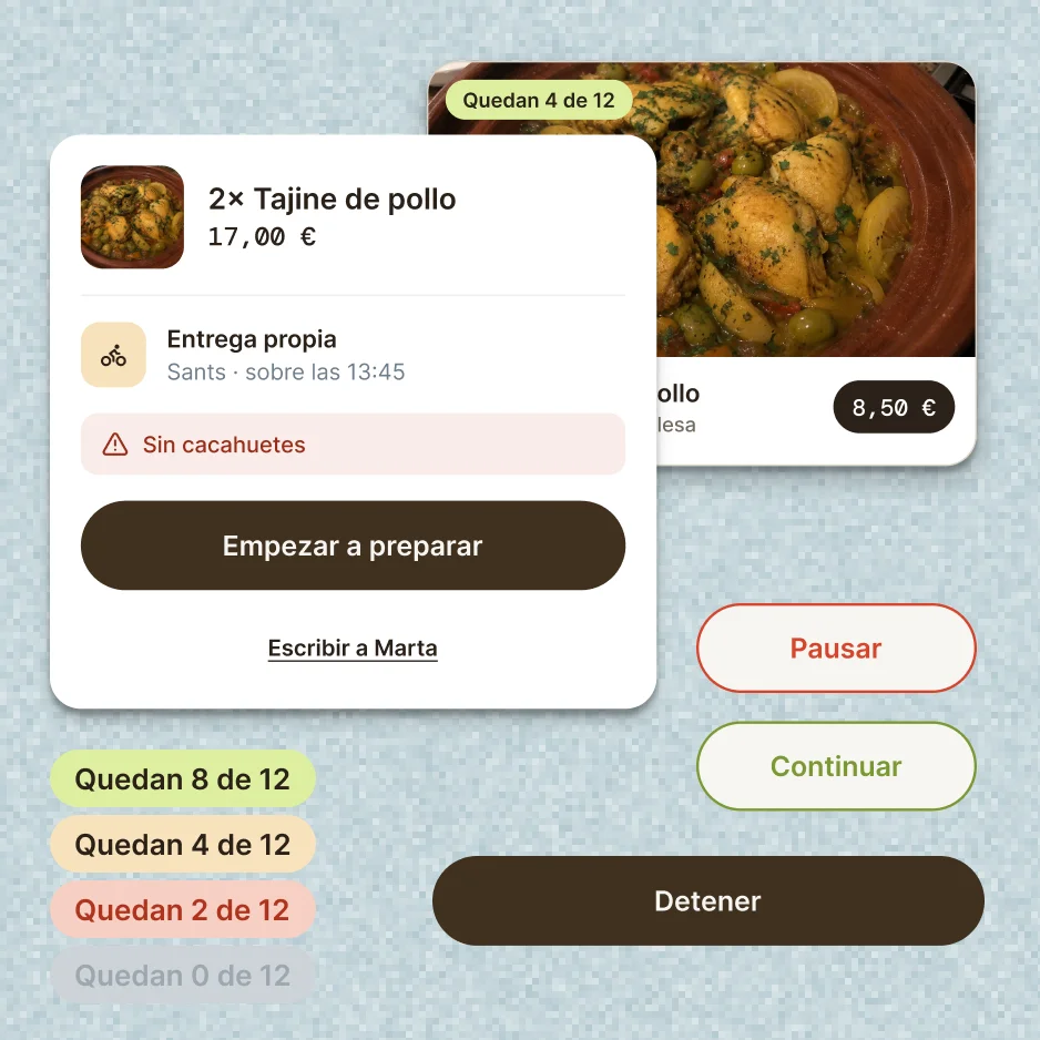
Not everything is drawn. Limerick set dead straight, one icon set, one grid that doesn’t move, because you’re trusting a stranger with your dinner and your card, and that layer can’t be cute. The colours are named after things in any kitchen. The hand shows up only where it earns its place, then gets out of the way.
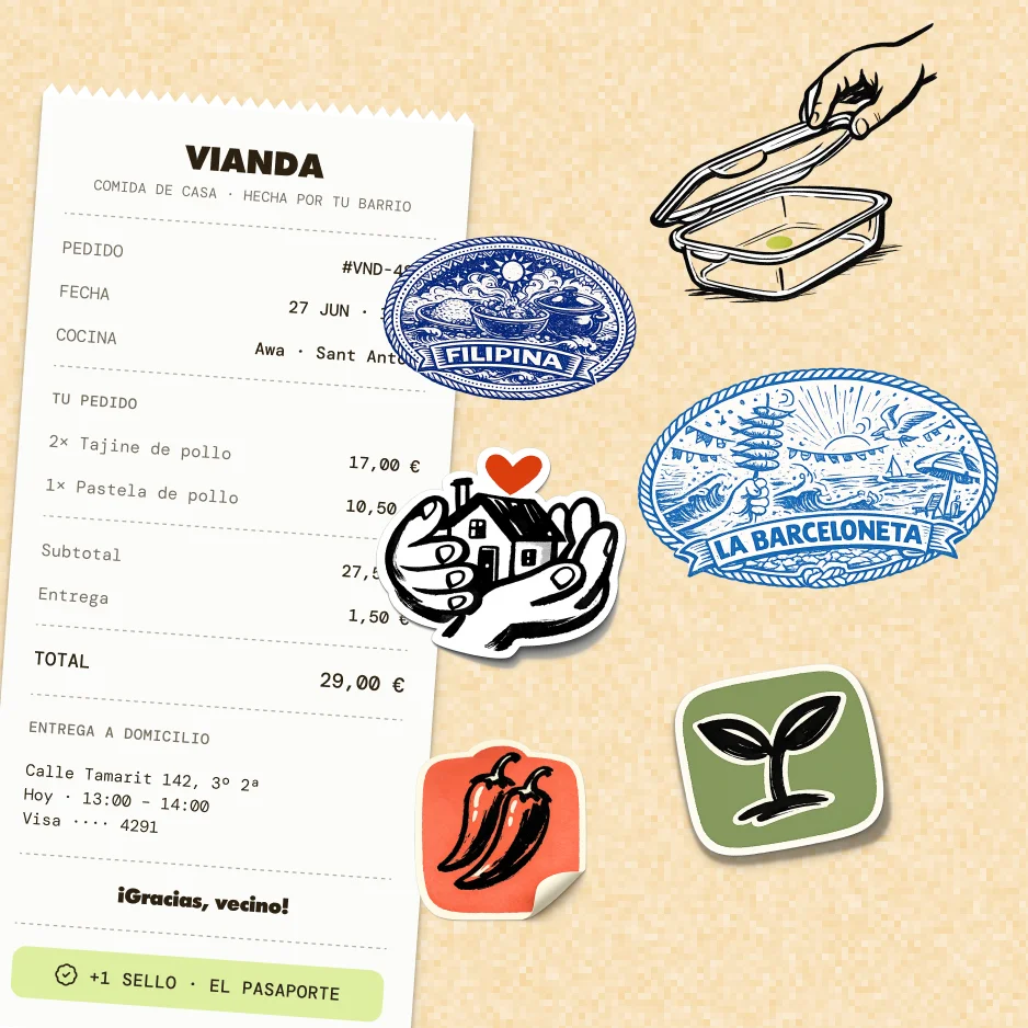
The legible part is in charge. The homemade part gives it its soul.
«Lo legible manda; lo casero pone el alma.»
The product.
Selling dinner over WhatsApp means endless chats, no payment protection, and cooking blind. Buying it means knowing someone who knows someone. Five decisions turned that into a product.
«Cocino para mi familia. Ojalá pudiera vivir de esto.»
the two apps.
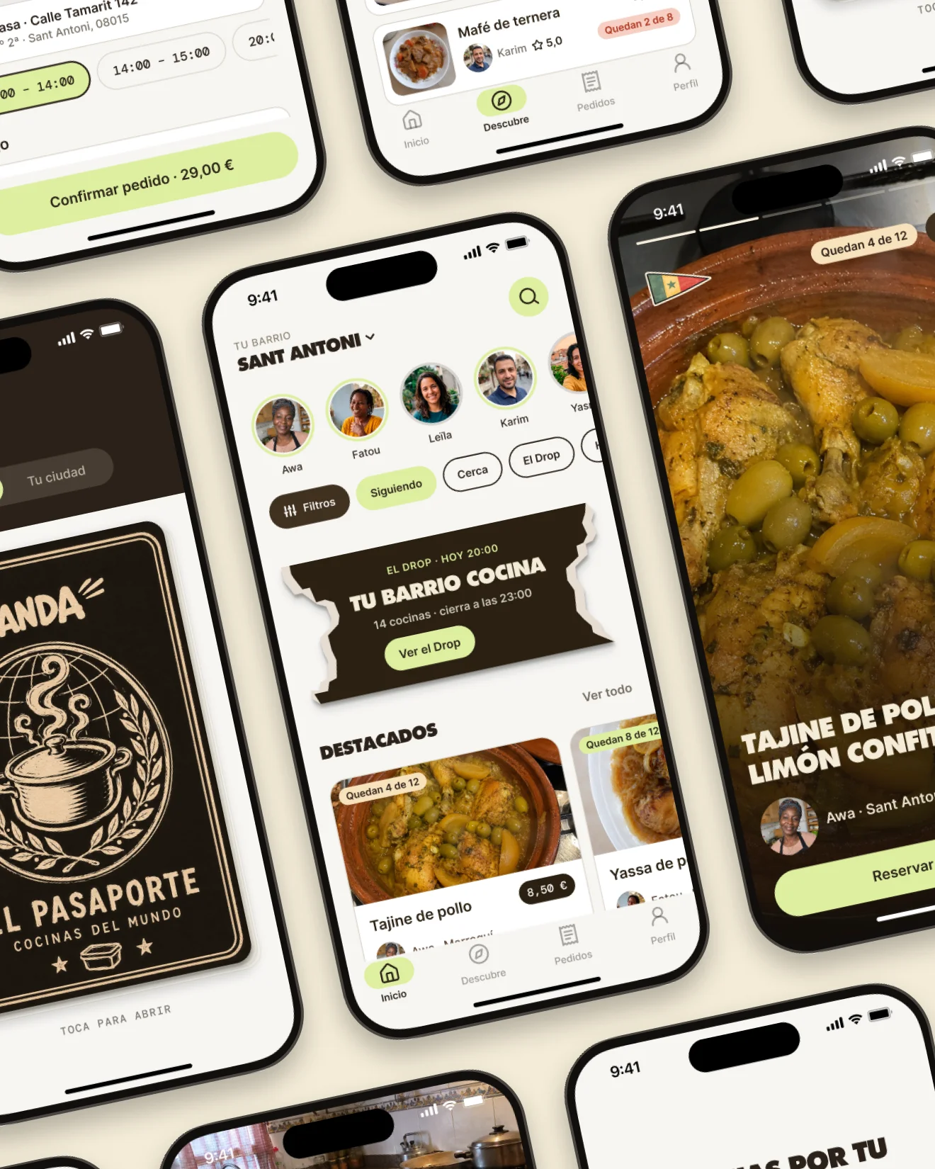
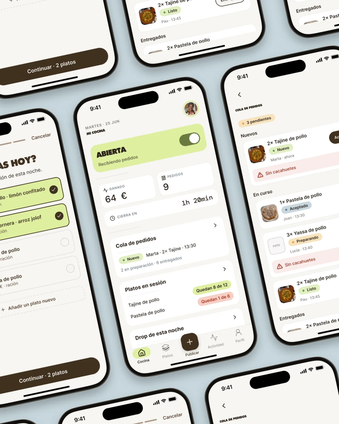
A cook is running a business. A neighbour is buying dinner. Fifty-two surveys split clean down that line. One app with a toggle would have served neither, so I designed both.
the design system.
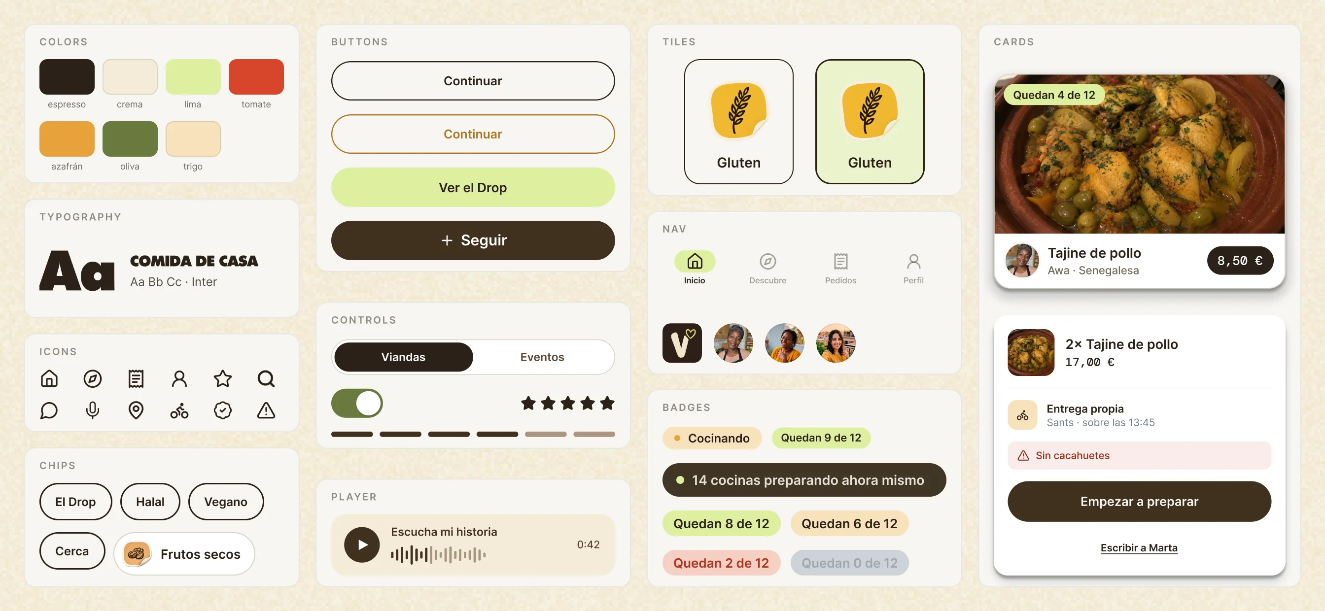
Two apps drift apart unless something holds them together. Tokens, components, one type ramp, one icon set, thirteen allergen stickers and nine diets that every dish card inherits. It’s why 163 screens read as one product, and why the second app took a fraction of the time the first one did.
the drop.
A cook is not a restaurant. Five cooks told us the same thing: they cook a fixed number, once, then they stop. The 2022 decree agrees, it caps a home kitchen at a hundred kilos a week. So instead of treating that limit as a problem, I made it the event. Every night at 20:00 the barrio publishes dinner, and when it’s gone, it’s gone.
the tracking.
A neighbour cooking for you isn’t a warehouse. So the order doesn’t say “on its way”, it says what’s actually happening, eight times, and every one of them is drawn.
the voice note.
Cooks record their bio instead of writing it. You press play and hear the person before you eat what they made. It also means a cook whose third language is Spanish never has to write a charming paragraph to be trusted.
You are about to eat food cooked by a stranger. A photo doesn’t fix that. A voice does.
The details.
Nobody gets hired for an empty state. I drew twenty-two anyway: every empty screen, every closed kitchen, every error. The screen you see when nothing works is the one that decides whether you come back.
the microcopy.
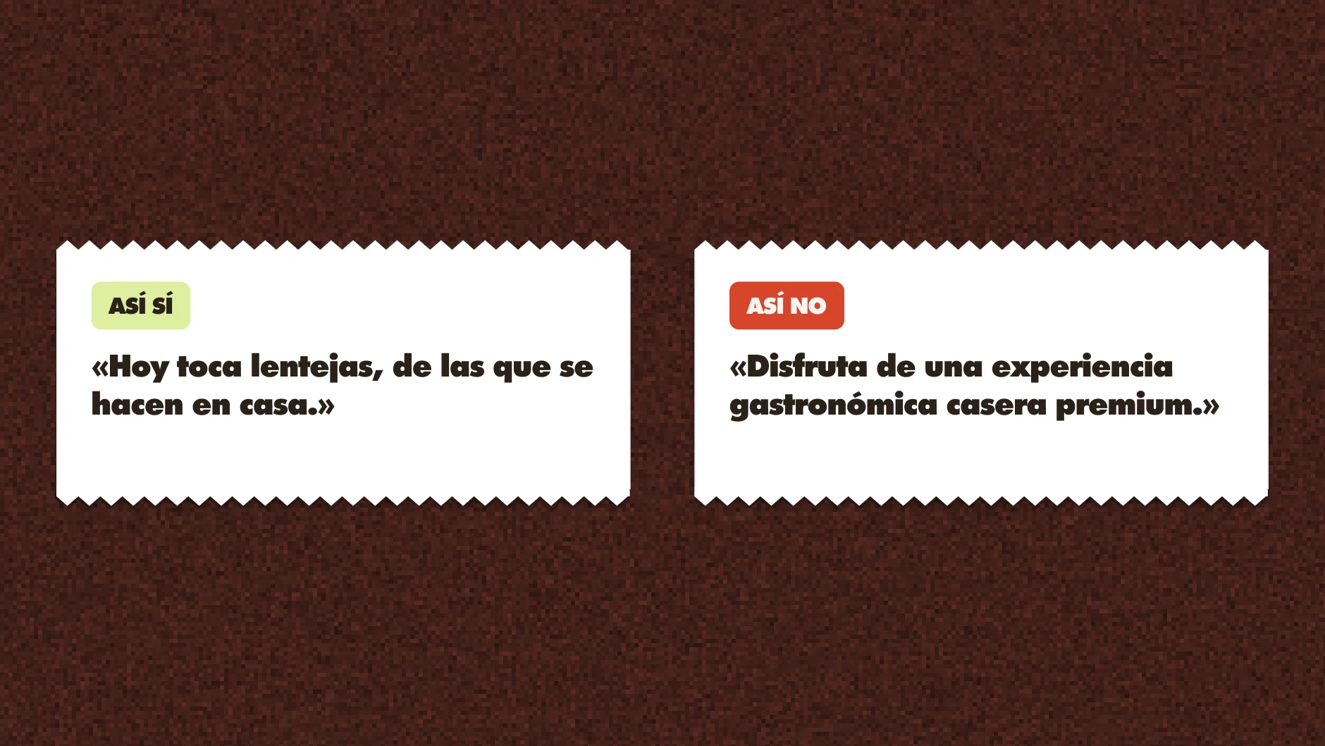
Every line had to pass one test. Not «Disfruta de una experiencia gastronómica casera premium». «Hoy toca lentejas, de las que se hacen en casa». One of those is a brand talking. The other is your neighbour.
the edge cases.
Every way it can go wrong, drawn: the kitchen still closed, the order queue empty, the thing that breaks. Not one is a spinner. «Algo se nos quemó» is a different product from «Something went wrong», and an error screen is the only time you're definitely talking to someone already annoyed. Same cost to build, so I built them.
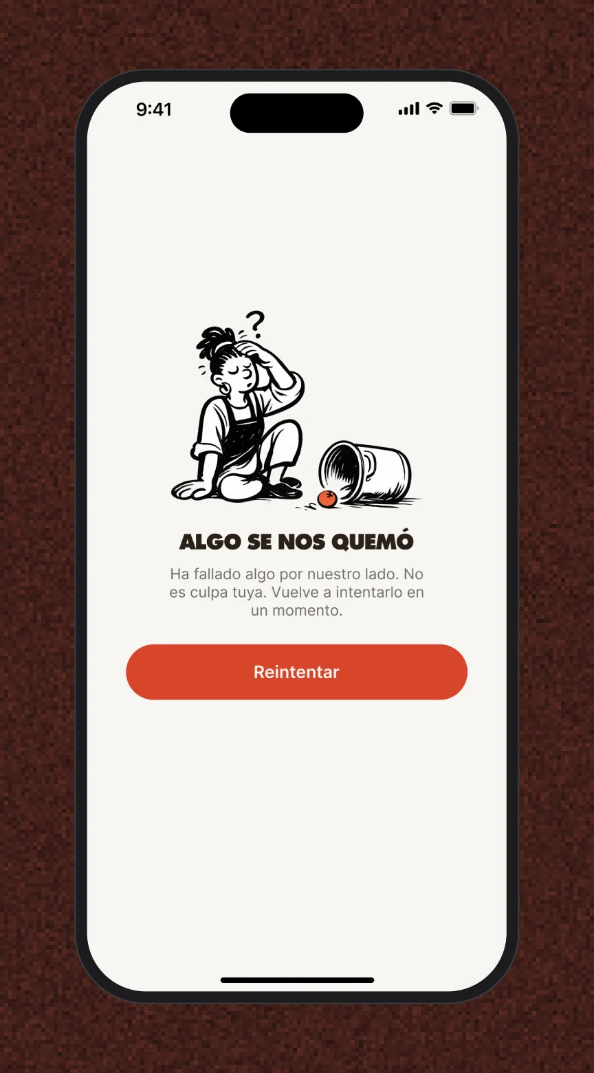
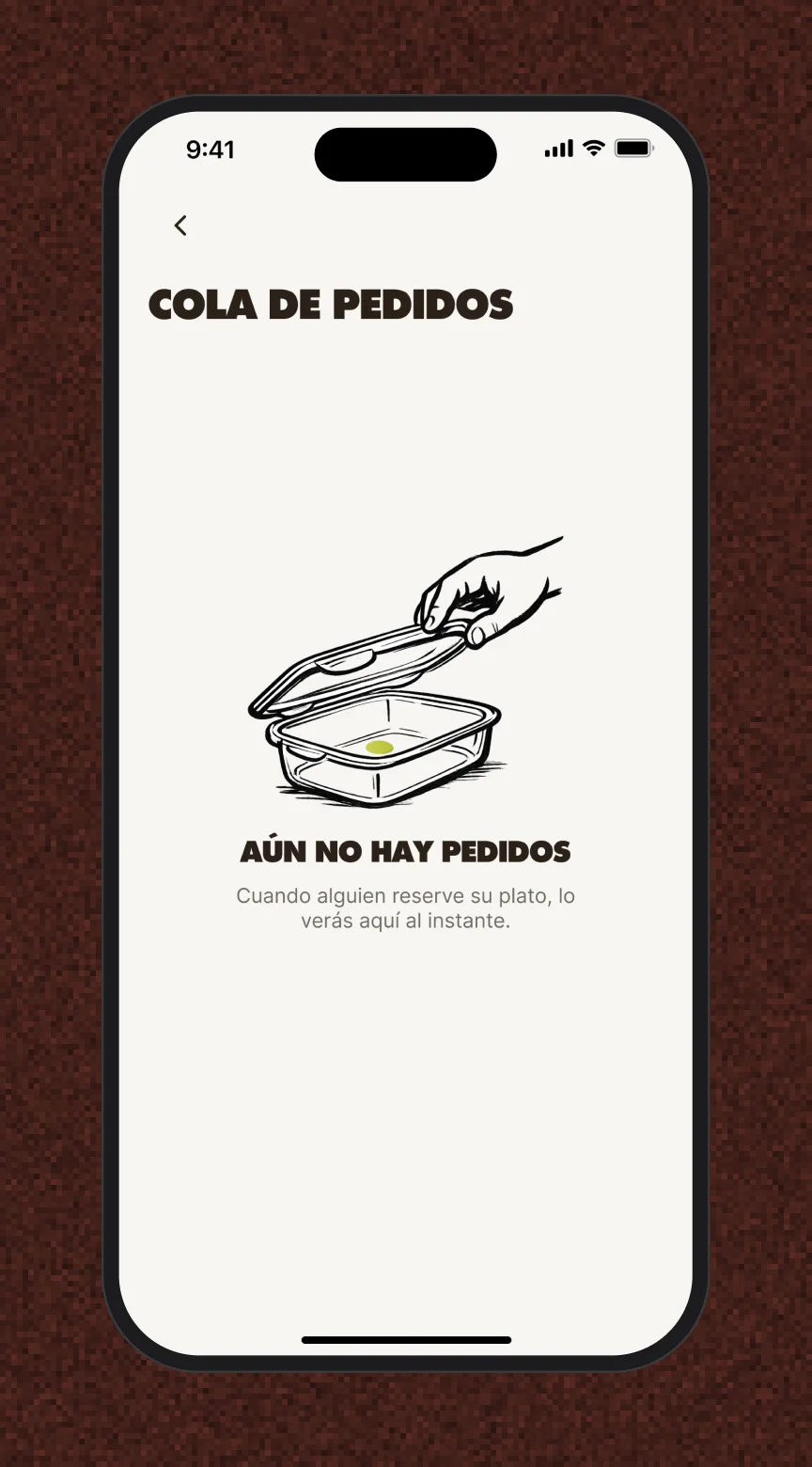
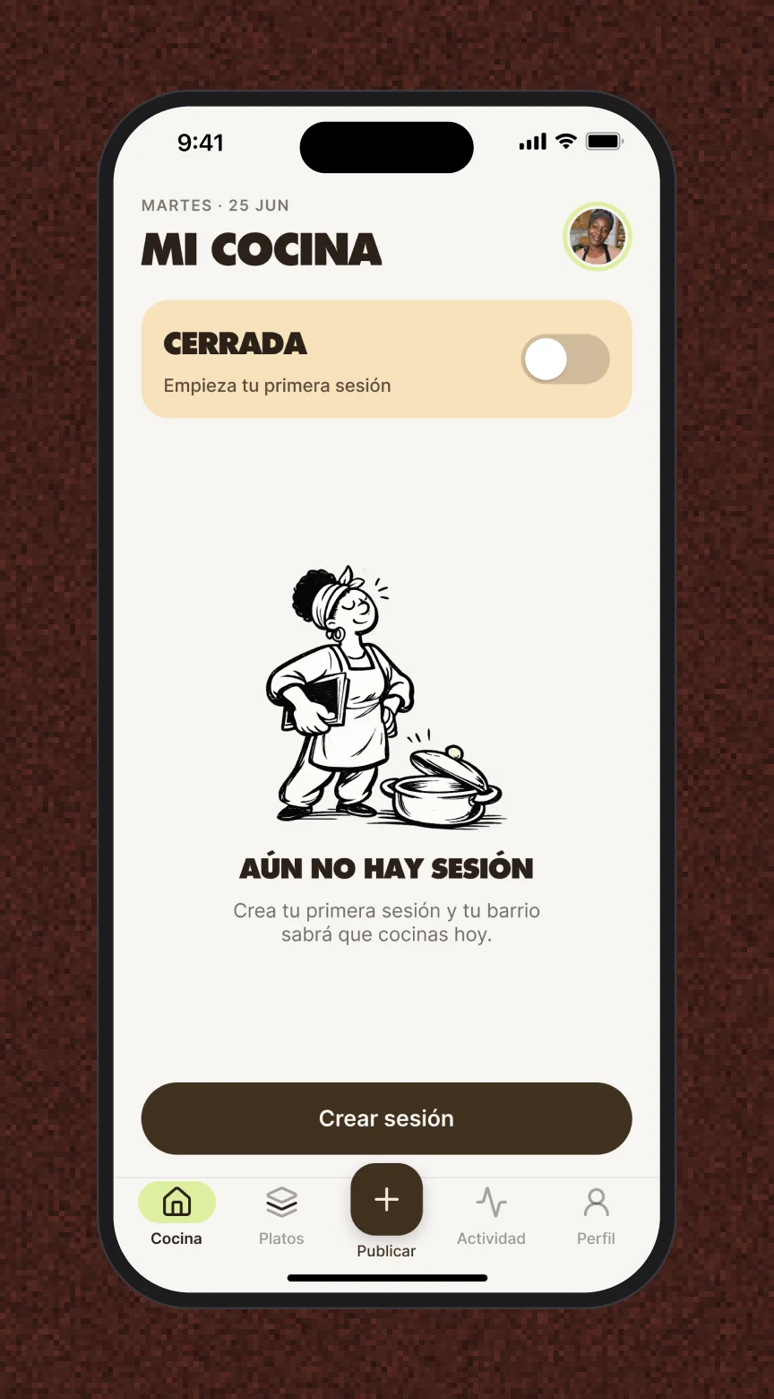
The part that’s easy to skip is the part I stay for.
What changed.
Vianda closed as a complete two-app prototype wearing one identity, from the app icon to the takeaway box. Here is what I got wrong on the way there.
the one that broke.
My first version had no textures, no drawn line, none of the homemade layer. Clean, correct, and completely generic. It looked like every other delivery app, which is exactly what Vianda is not. I threw it away and rebuilt it.
My first version looked like every other delivery app. So I threw it away.
if I kept going.
We shipped in Spanish only. Our own research showed the informal market runs in Spanish, Arabic and half a dozen other languages. It was the right call for the time we had. It’s the first thing I’d fix.
recognition
Elisava Master Awards · Nomination · 2026