Frizz
UI/UXVisual IdentityFrizz is a healthy drinks brand for young people and families. It drops the joyless wellness look and makes healthy feel fun.
- role
- Visual identity and UI/UX
- timeline
- September 2025 to January 2026 · Master in UX Design, Elisava
- deliverables
- Visual identity, packaging design, design system, a landing page, the product pages, and a menu
- tools
- Figma
what came out of it
A brand, a design system, and an online store where every component adapts to the flavour it sells. Documented for development.
The short version.
Frizz makes fruit sodas with vitamins and no added sugar, sold in organic shops and cafés around Spain. It wanted its first online store, with a fifth of all sales expected from it within a year.
The brief came with two problems. People read normal sodas as unhealthy and healthy ones as boring, and nobody buys a flavour online that they have never tasted. It also came with almost nothing to build on: a name, an optional logo, and the technical sheets. The rest was mine to define.
the idea.
Flavour is the identity. Every flavour owns a colour, a can, and its own version of the store. Everything else stays fixed: the type, the layout, the navigation. Choosing a flavour changes the store's colour, not its structure.
The world.
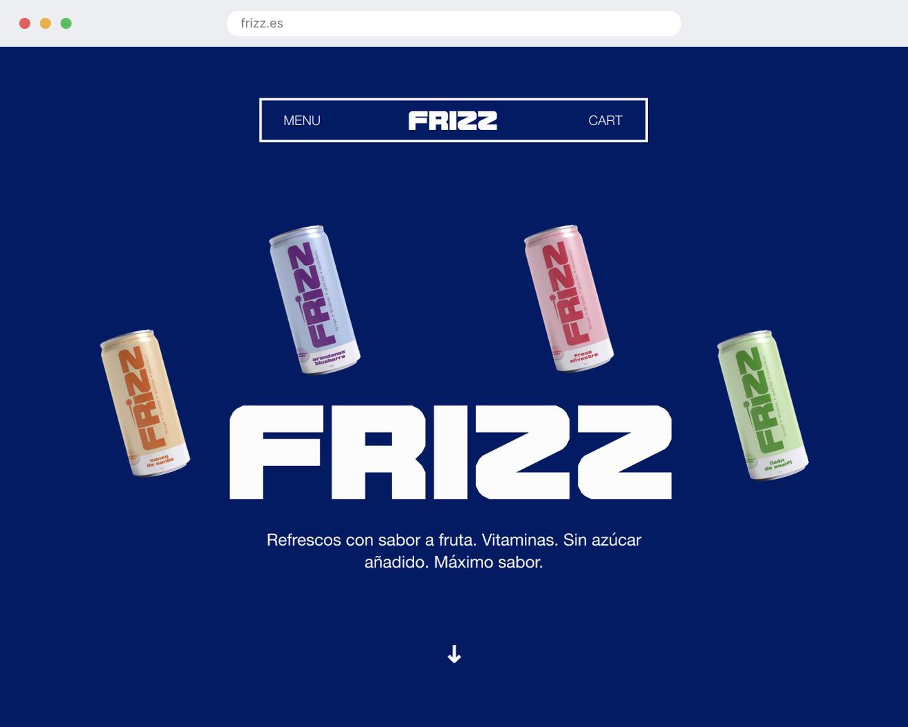
There was no brand, so I drew one before I designed a single screen: a wordmark, four cans, and a kit short enough that Frizz could show up on things that are not packaging.
the mark.
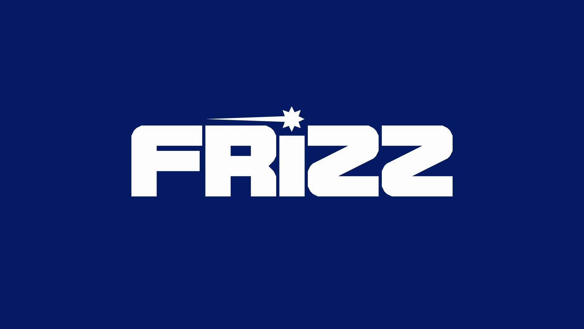
FRIZZ is set in Nynjara, a display face with one weight and no lowercase, so there is no quiet version of the logo to fall back on. The burst replaces the dot on the i, and it is the only ornament the brand owns.
the can.
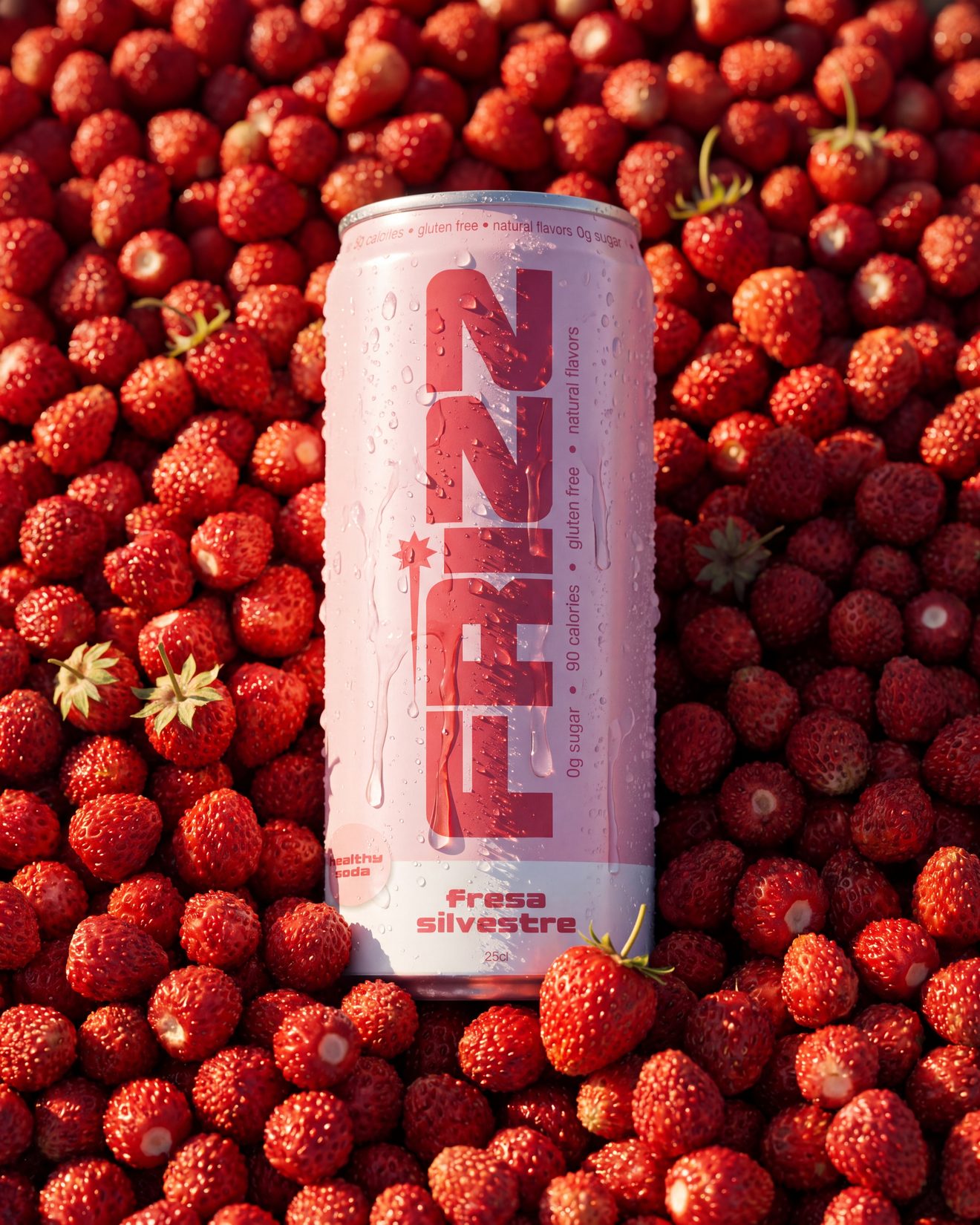
Each flavour is named for where its fruit comes from, fresa silvestre, limón de amalfi, mango de manila, so the name does the work packaging usually spends a photograph on. One colour block per flavour, the name at full width, and the claims, no added sugar and ninety calories, running in a strip around the can instead of sitting in a box. The facts are all there. They are just not the loudest thing on it.
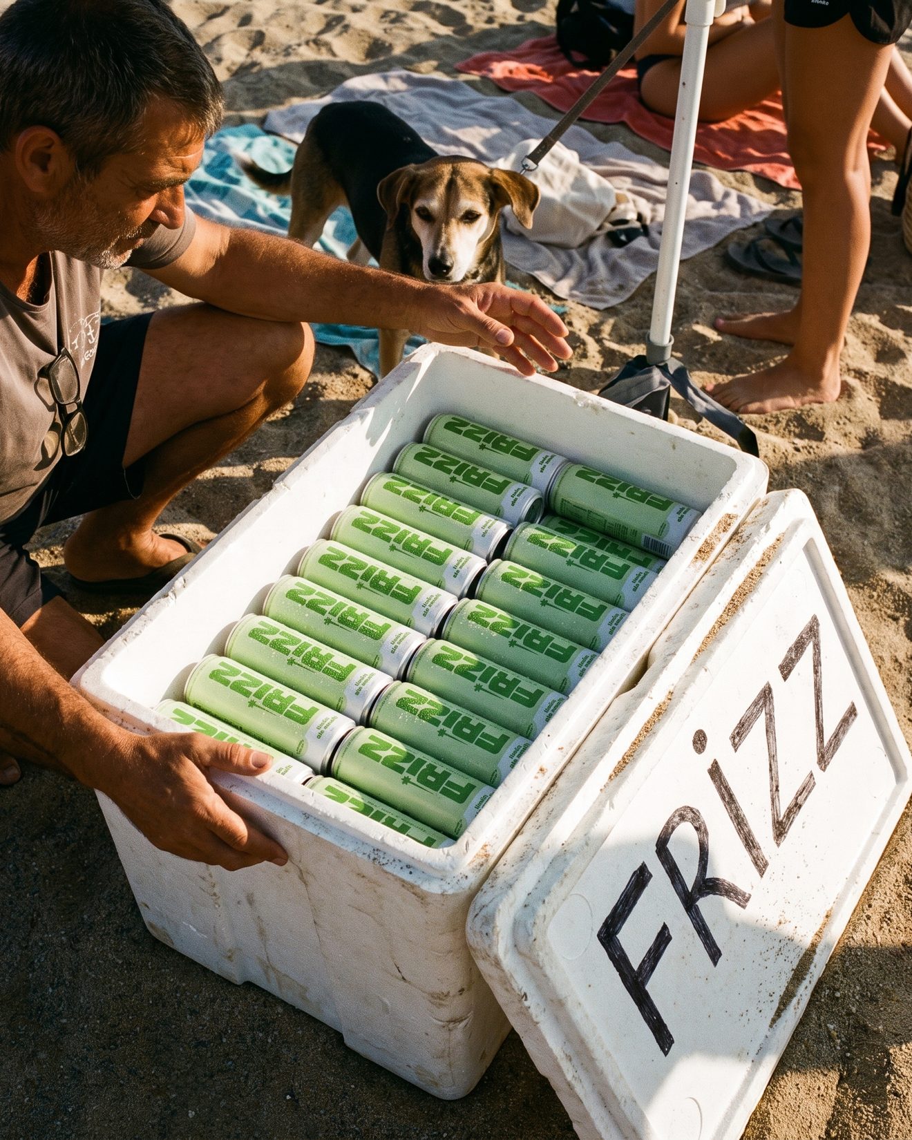
the brand.
A logo that only works on the can is not an identity. The same three elements, colour block, wordmark and burst, had to hold on a kiosk, a van, a cooler and a tote, at any size, without redrawing anything. Keeping the kit to three is what makes that possible, and it is why the brand can be applied by someone who is not me.
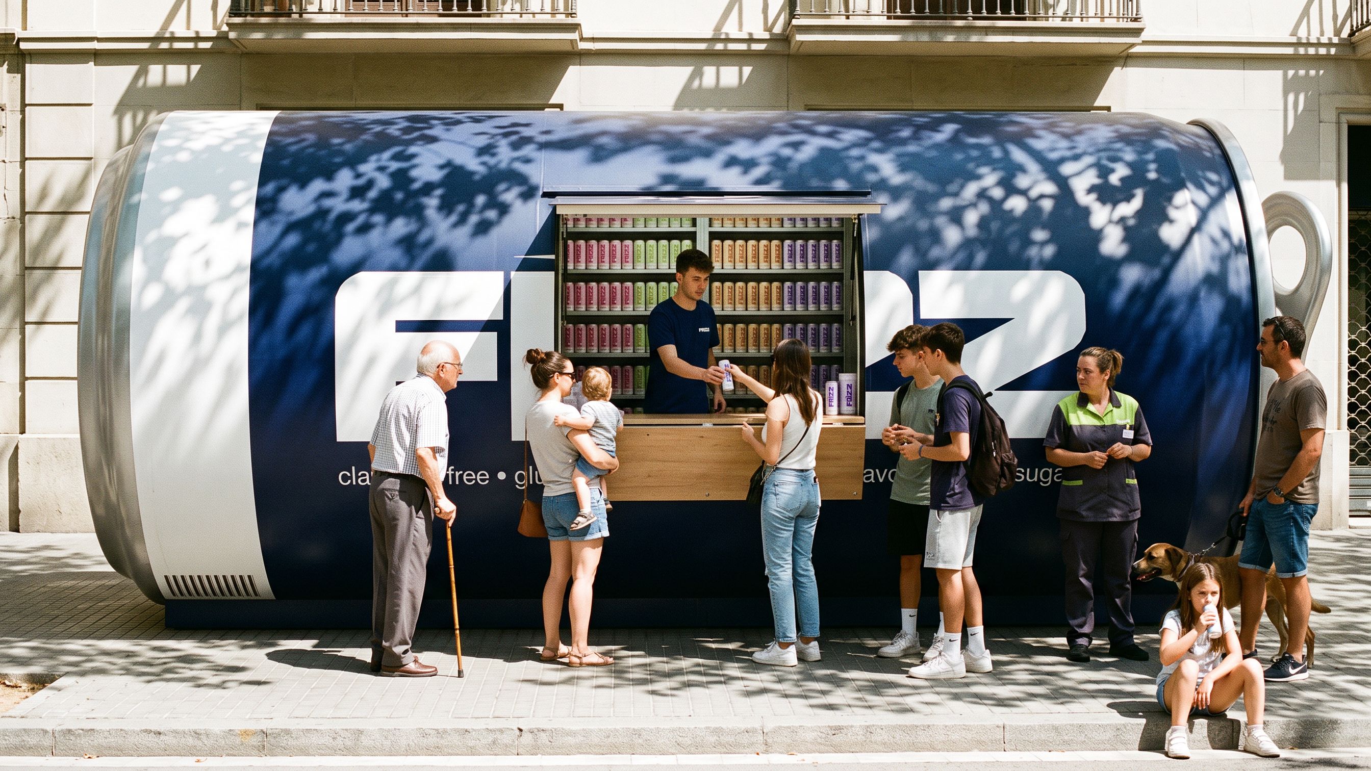
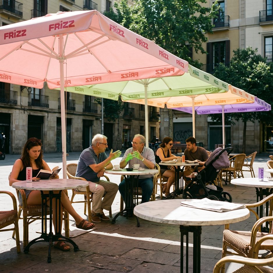
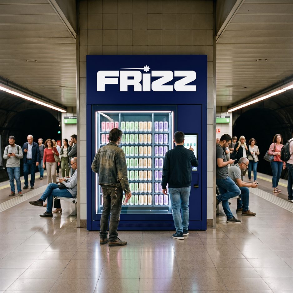
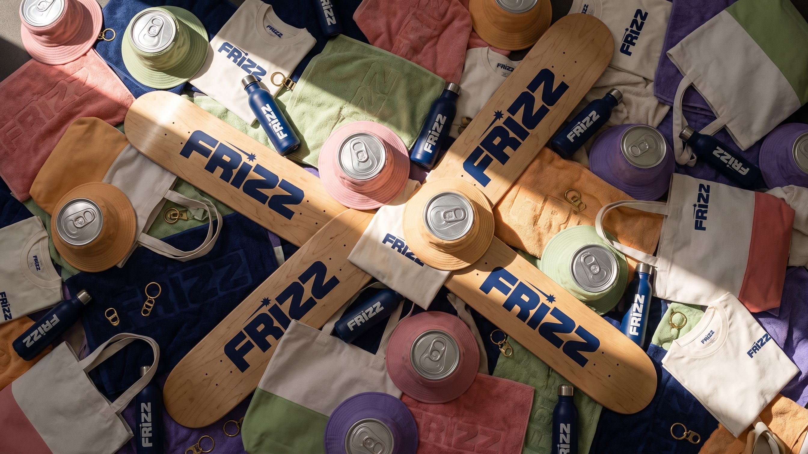
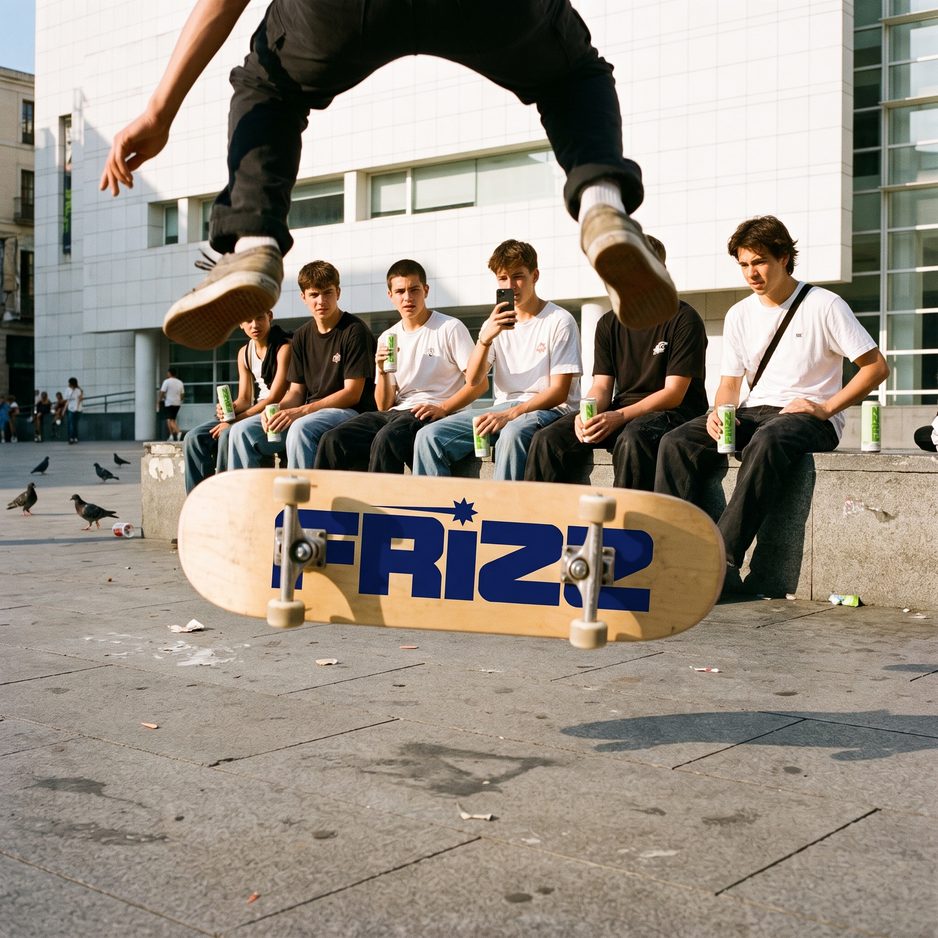
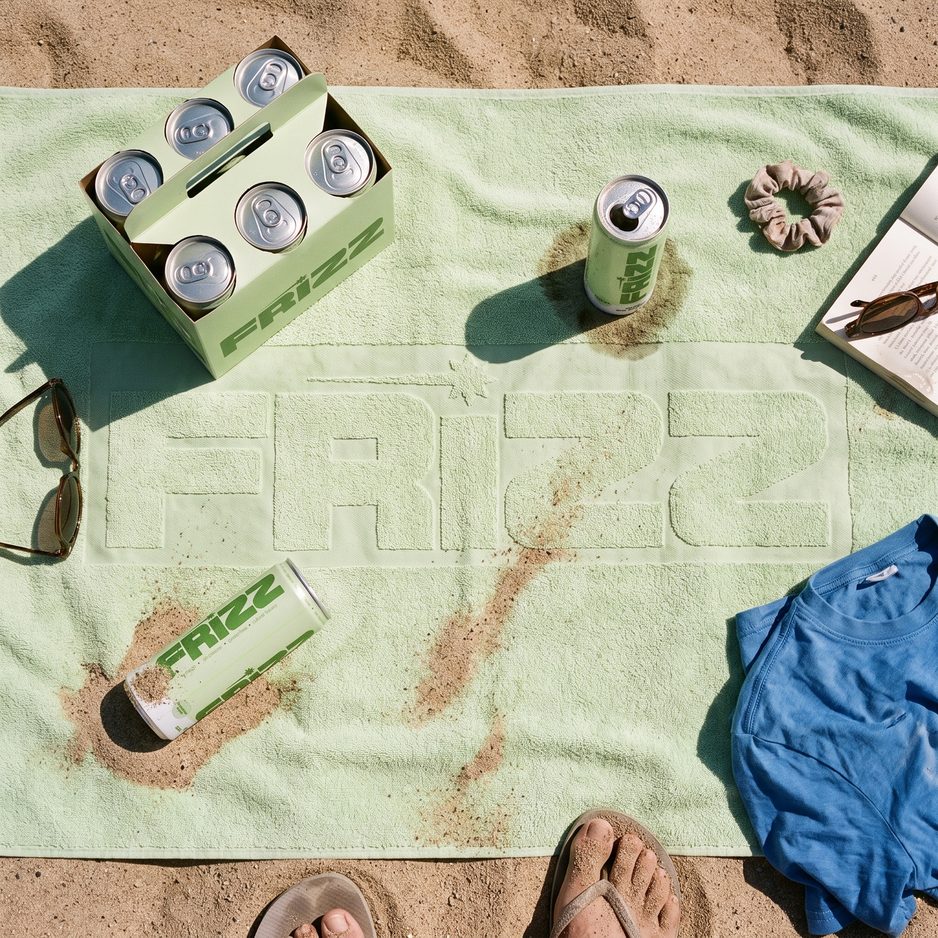
Healthy is the ingredient list. Fun is the brand.
The product.
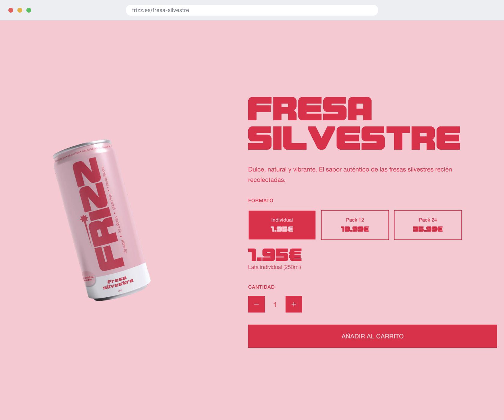
One store, four flavours. The landing sells the brand top to bottom, each fruit gets its own page, and the whole interface takes the colour of whatever you are looking at.
the store.
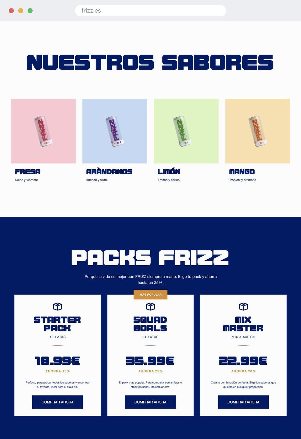
Nobody arriving has tasted this drink, so the landing is ordered to answer why bother before it asks for a sale: the story, the flavours, the benefits, the packs, where to buy, the merch, and the green commitment. The product pages then run on the same bones: the can, its fruit, ingredients you can recognise, the facts, the formats. Prices sit in vertical cards so a label never wraps, and the quantity controls are sized for thumbs. Parents get the label. Everyone else gets the flavour.
the system.
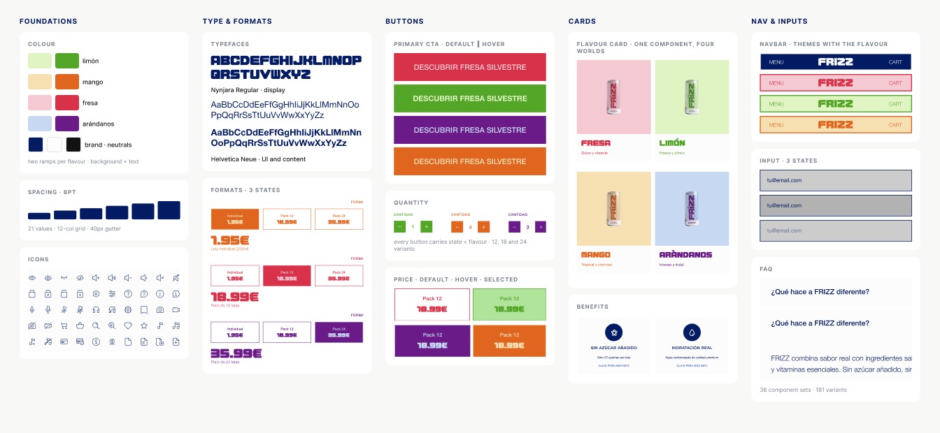
Every flavour carries two colour ramps, one for backgrounds and one for text, so a component can go loud and still pass AA in all four worlds. Above them: one display face that only shouts, four weights of Helvetica that never do, and thirty-six component sets carrying a hundred and eighty-one variants, every state included, on an eight-point scale.
the switch.
The interface reads the flavour like a theme. Navbar, buttons, cards, badges, prices, all of it swaps with the fruit, and none of it is hardcoded. The day Frizz adds a flavour, the store needs a palette and nothing else.
The store doesn't show you the flavour. It becomes it.
The details.
The people Frizz is for do not want to be sold a drink. So part of the store is not a shop at all: it is what the brand watches, plays and recommends.
the feed.
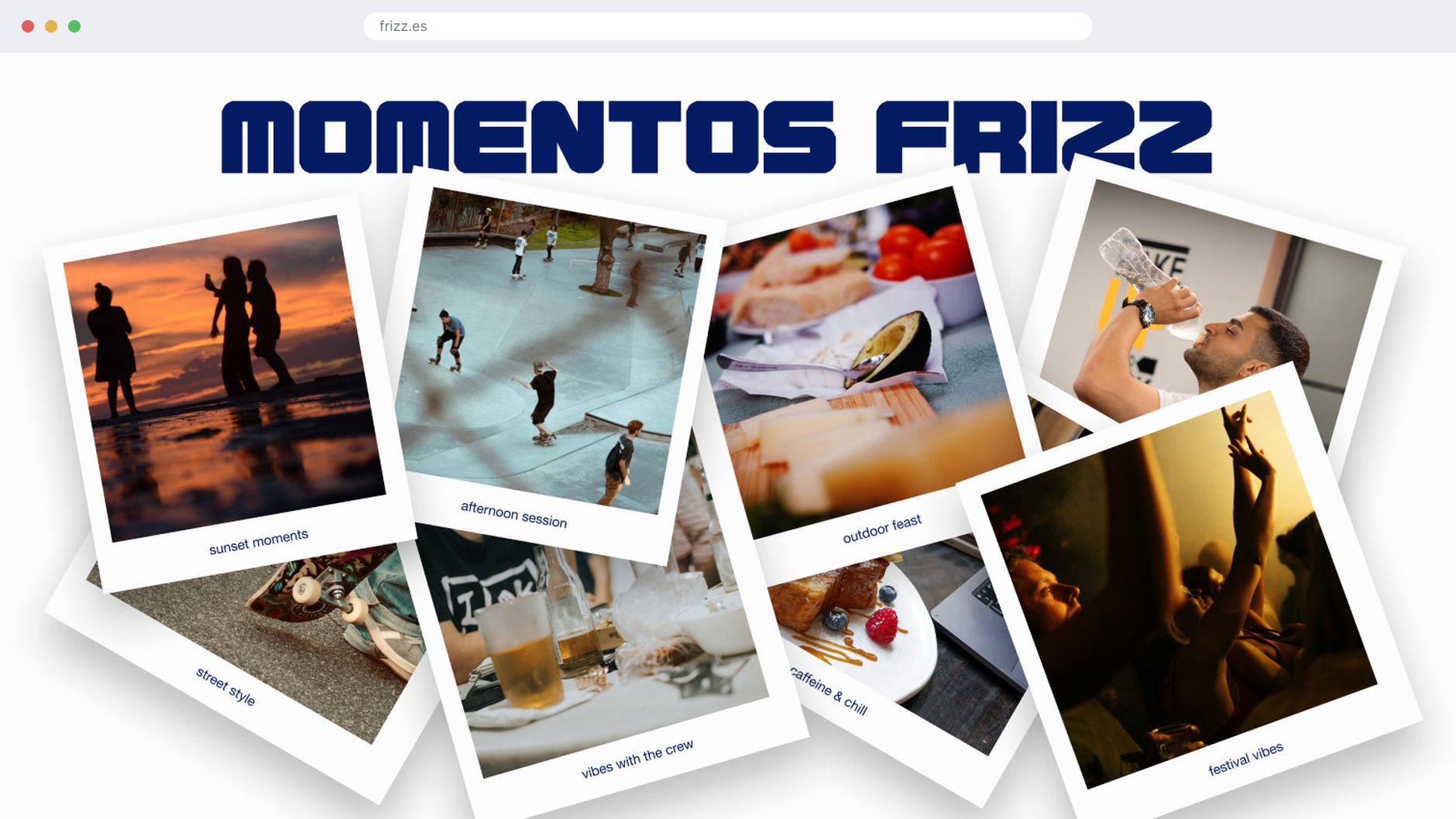
Momentos Frizz sorts the brand by occasion, street style to sunset, and the community section fills those categories with people posting themselves with the can under #FRIZZmoment. The brand’s photography direction came out of the categories, which means the customers end up shooting the campaign.
the guide.
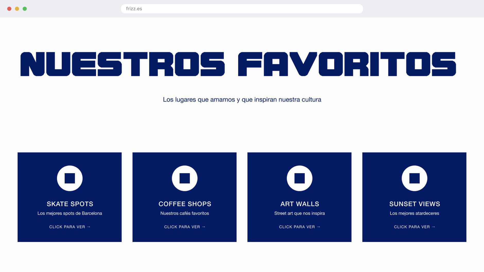
Nuestros Favoritos is four Barcelona guides sitting inside a drinks shop: skate spots, coffee shops, art walls, sunset views. It is the clearest statement of who the brand is for, and it does not mention the product once.
the soundtrack.
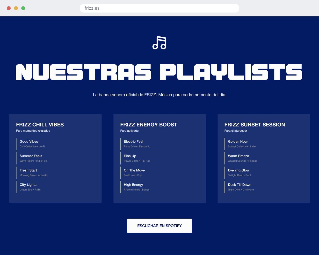
Three playlists, Chill Vibes, Energy Boost and Sunset Session, with full track rows and a link out to Spotify. Every flavour is sold with a moment attached, so the store hands you the music for it.
What changed.
Frizz closed as a full identity, a design system and a working store, documented for development with component specs, naming conventions and working code for the parts that are hard to describe in words. The colour system was the expensive decision: four palettes to check, four versions of every state, a heavier build. I would make it again. A single palette would have shipped faster and made four flavours look like one product in four wrappers.
the one that broke.
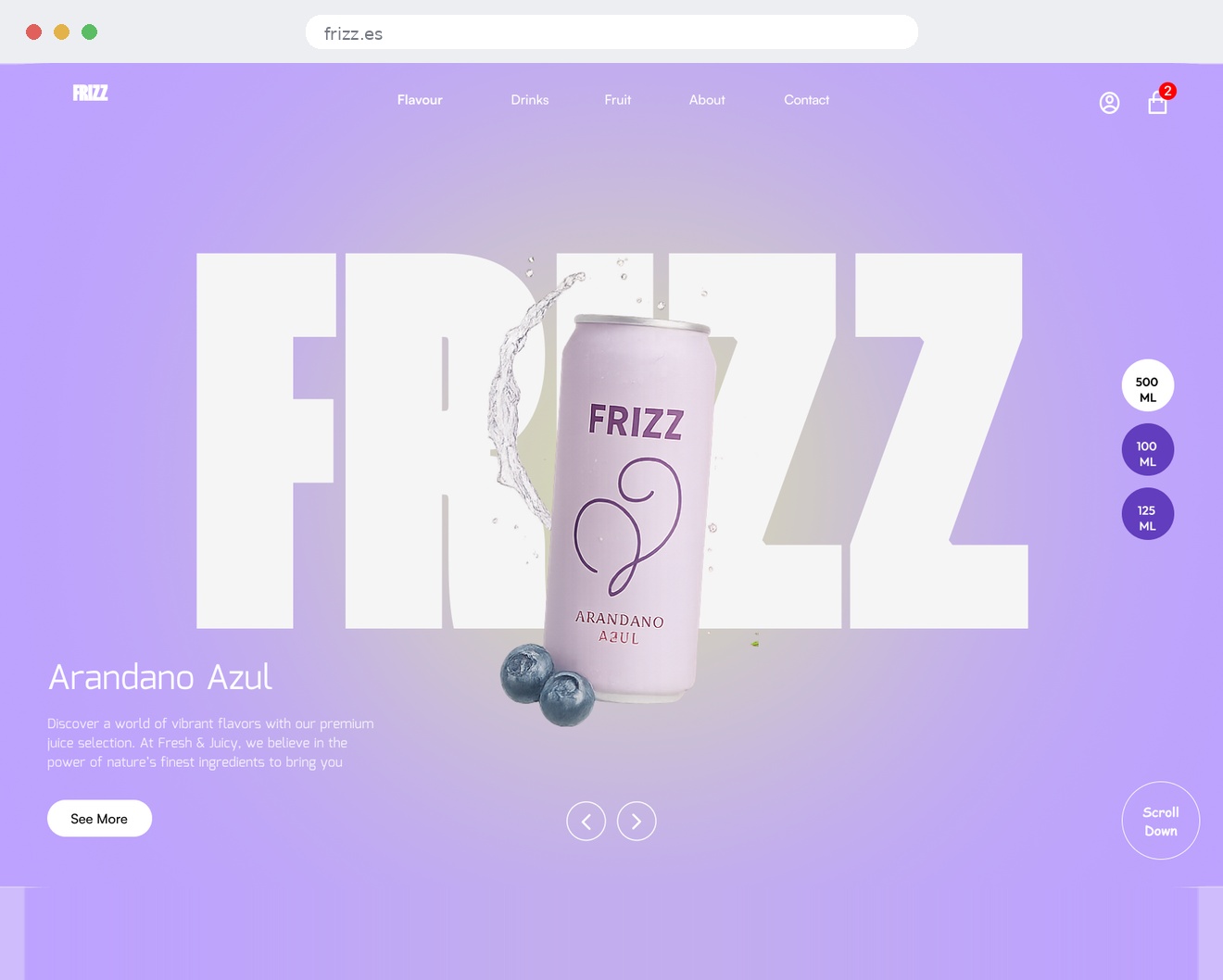
The store opened on a lavender gradient with one can floating in front of the wordmark. The idea was centered around one flavor rather than the brand.
The best thing I made was the first thing I cut.